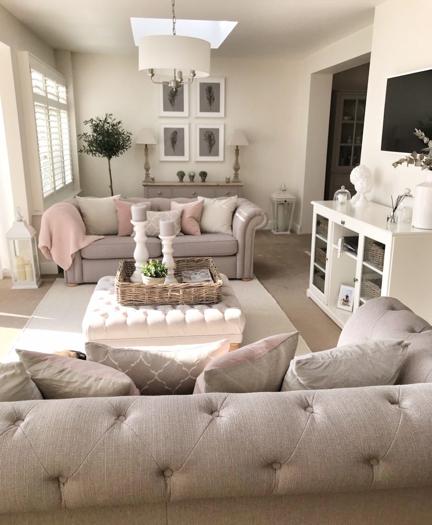
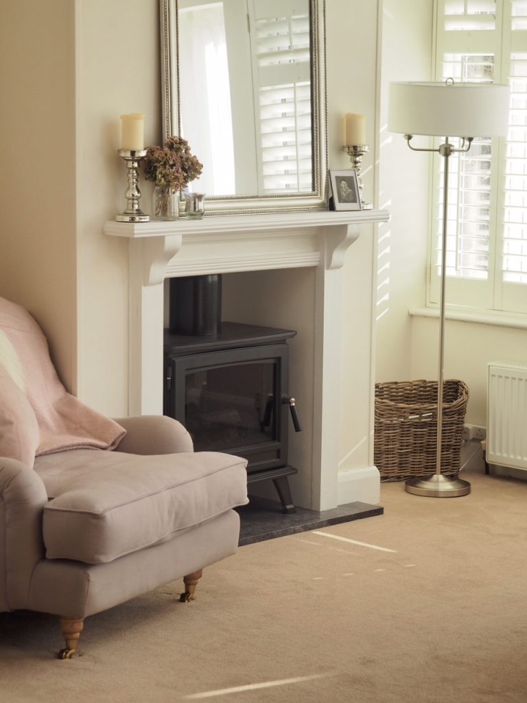
The past couple of months I’ve been finding my feet with our living room; adding in a fake chimney breast with log burner effect fire plus the addition of an armchair in the corner meaning the console table that was against that wall was relegated to the other side of the huge (but strangely sized due to being a conservatory once upon a time which we converted in to a more useable space) room.
I’ve been in a bit of a stump since then about what to do. I felt the room was lacking ‘something’ & although interiors is my thing, I’ve been unsure as to what to do to bring it to life since the Christmas decorations came down & it’s all just looked a bit bare.
To see some before pictures for comparison, click here.
Instagram gives me so much inspiration, but it’s also put me in contact & bought together so many people who share the same enthusiasm for all things ‘house’ as me. Last year I met up with (& ended up stumbling home at 3am after too many bottles of prosecco…) local interior designers Laura (co-founder) & Lucy (senior designer) for online interior design website My Bespoke Room. All I can say is, talking to people who know what you’re talking about when you say Elephants Breath has been a revelation.
Sometimes it takes a new pair of eyes & a different perspective to put a spin on something so I called upon their help & guidance. My Bespoke Room was founded with a view to make interior design affordable & accessible; with a rating of 4.9 out of 5, a whole heap of over the moon customers (now with beautiful houses) & being voted the best interior designer & service on Houzz since 2015, they are fast taking over & changing the concept of the industry.
They offer 3 fixed priced packages depending on what you’re looking for; starting at £95 for a mini-makeover, £150 for a complete room design (single room), or £250 for a complete room design (large double/open plan/double reception room). I had my main furniture already but just wanted help adding some finishing touches & bringing it together so went with the first option. I was then matched with the most suitable designer based on a whole range of criteria from style of property, my personal taste, lifestyle, circumstances & so on before being talked through what I wanted to keep, what I wanted to achieve & areas I thought needed work. You also speak to your designer via the website through an online messaging system throughout; this keeps the friendly, personable approach alive which they strive for & I think is SO important for designing the perfect scheme for somebody!
After we finalised the layout (which stayed the same due to the funny shape – Lucy tried to move the furniture around on CAD but found this was the only option), my finished design was uploaded on to the My Bespoke Room platform & I have to say, I was quite nervous opening it, especially being somebody that has an eye for design & knows what they want (& normally how to get it…) but I was absolutely blown away. Lucy had hit the nail on the head & then some which was a miracle considering how fussy I can be!
You can view the design on the My Bespoke Room website here.
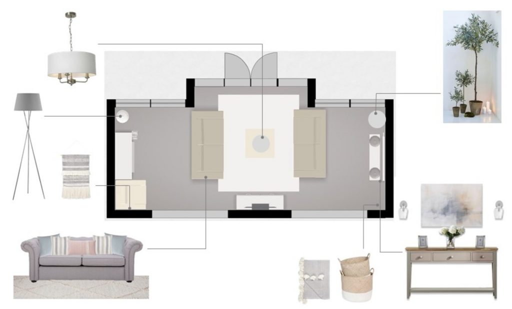
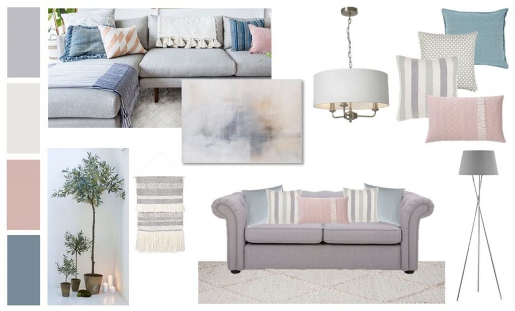
The mood board opens to an interactive shopping zone where you find product suggestions (& multiple alternatives) so I swapped around a few bits like the cushions which I thought were a bit too jazzy for me for some of the other options. The My Bespoke Room personal shopping team will then place the orders with each retailer, saving you hassle whilst also keeping you in the loop throughout & taking advantage of their exclusive discounts. This is the products & look we ended up with!
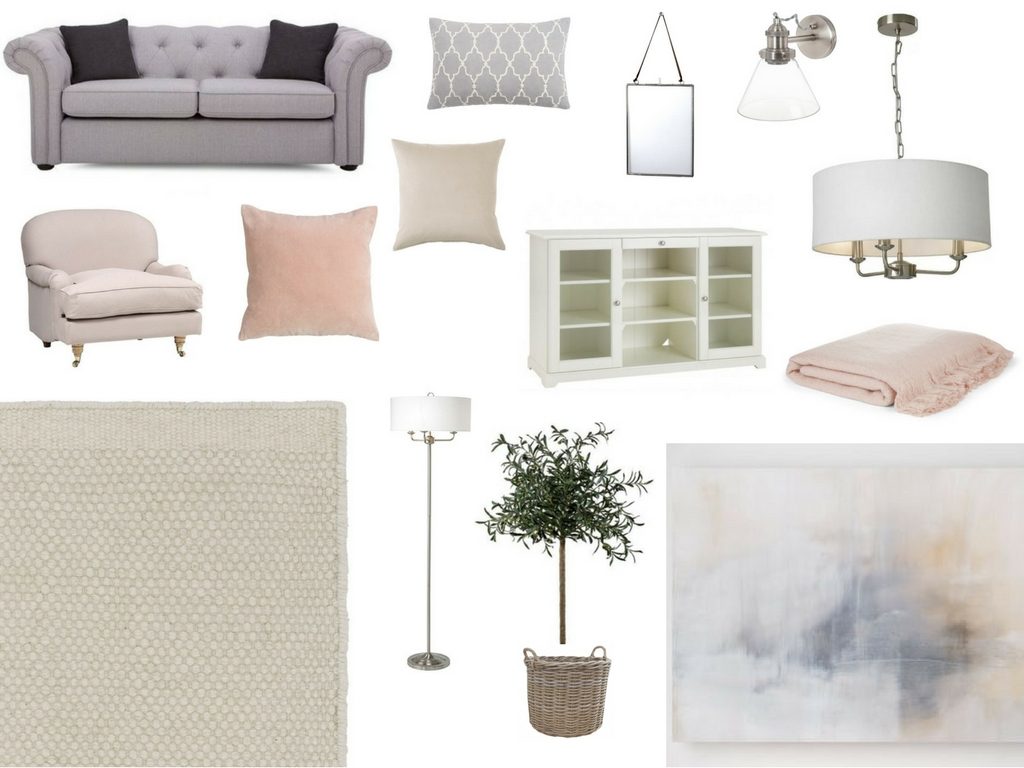
So what does the room look like now?
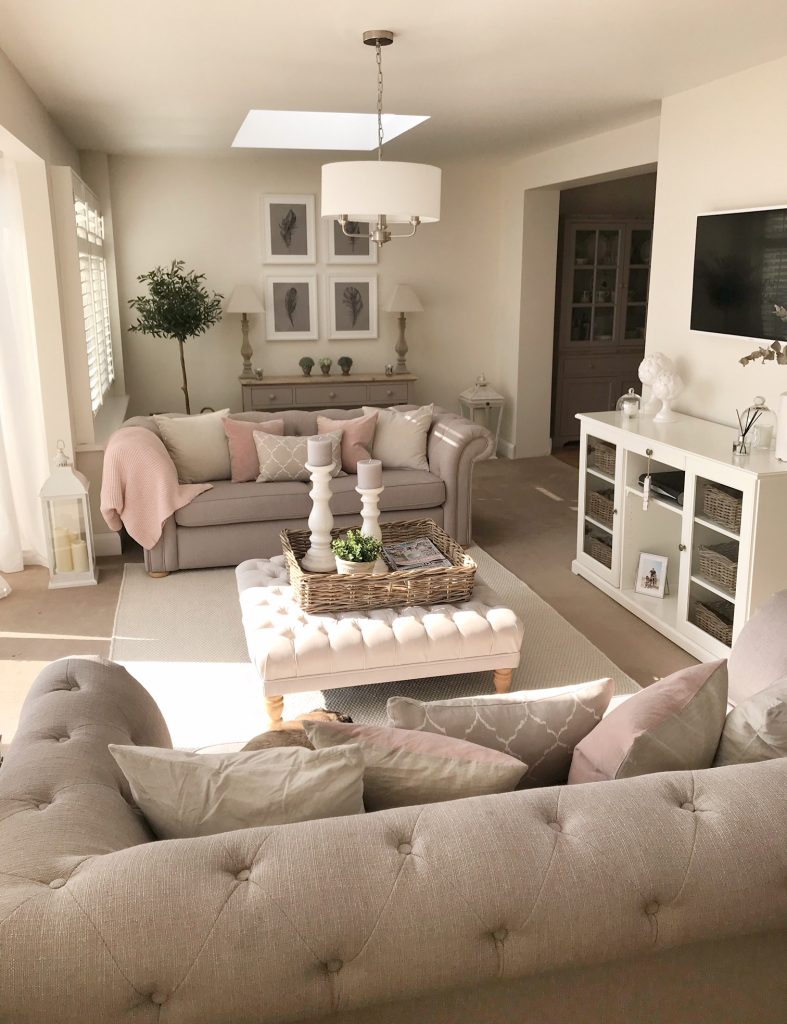
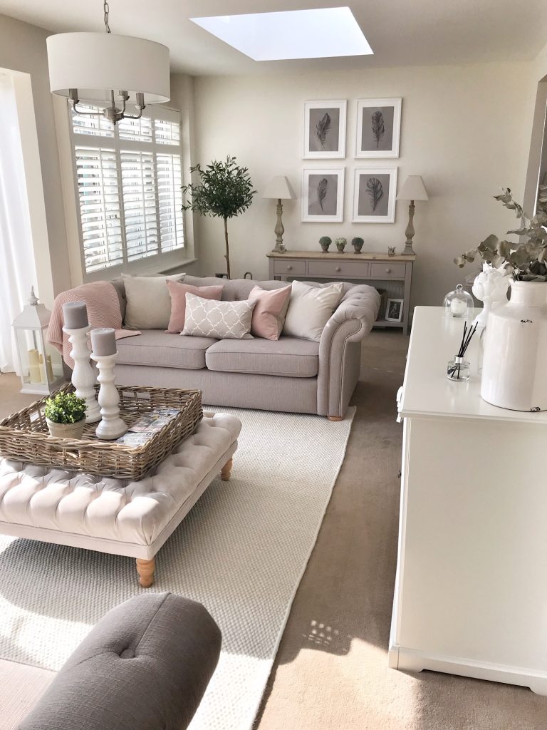
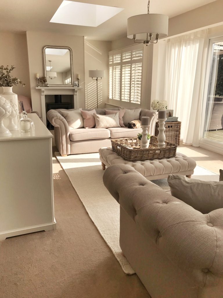
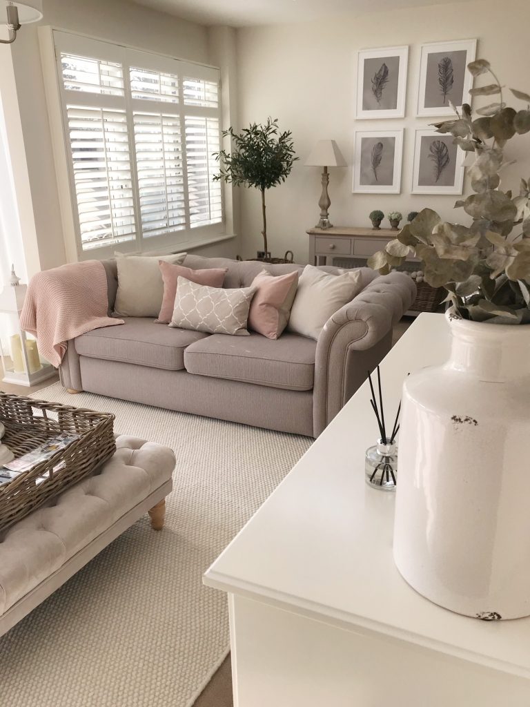
In interior design, one of the ‘rules’ with rugs is that it should be large enough for furniture to overlap & the front legs to sit on to draw the eye & create the illusion of space, you can read a guide on this here. This is something I really struggled with when looking myself (unless I wanted to spend thousands…) as the area between the sofas is so big but Lucy came up with 13 suggestions & I ended up going with the ‘Kolong’ from Urbanara who I’d never come across before. This is a whopping 2x3m rug priced at £399.00. I think that alone has completely transformed the space & added texture as well as ‘zoning’ an awkward shaped room. The carpet either side of the sofas isn’t the best quality & was quite down-trodden so it’s hidden that too.
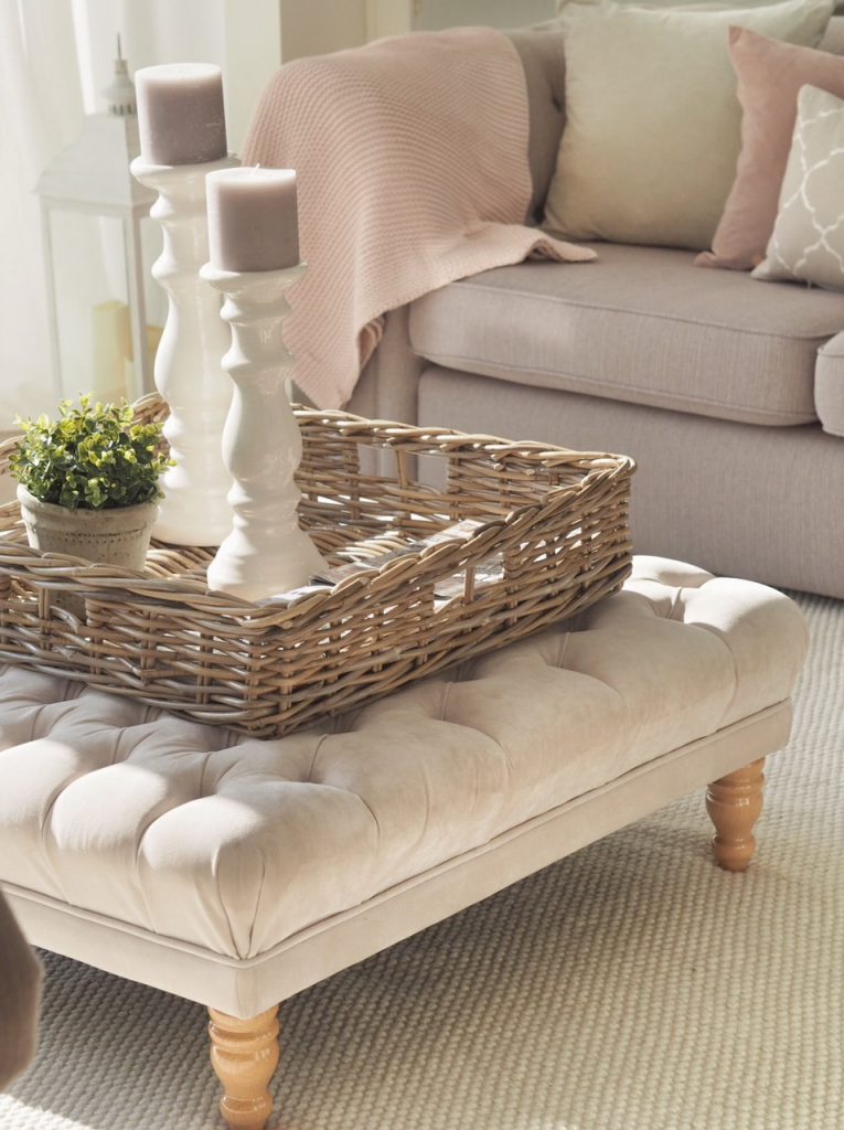
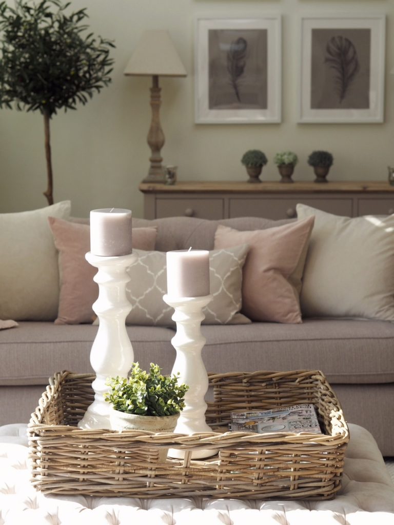
Being conscious to not clash with the buttoned footstool was a big one but it looks perfect. I also changed up the tray on top of the footstool with this wicker one to stick with the theme which is part of the Somerton range from Neptune. It’s the medium size here & leaves so much more room to put bits so it’s more of a coffee table feature. The white candlesticks are both Neptune as well & the little plant is artificial (because I can’t keep anything alive!) from Ikea.
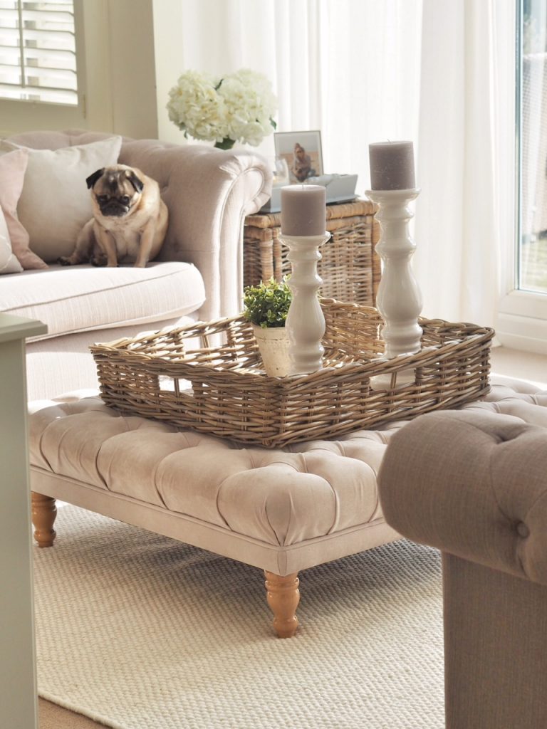
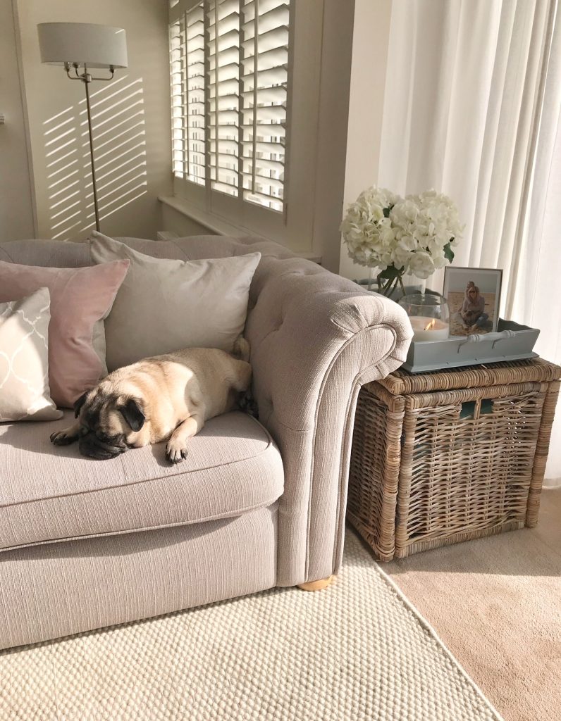
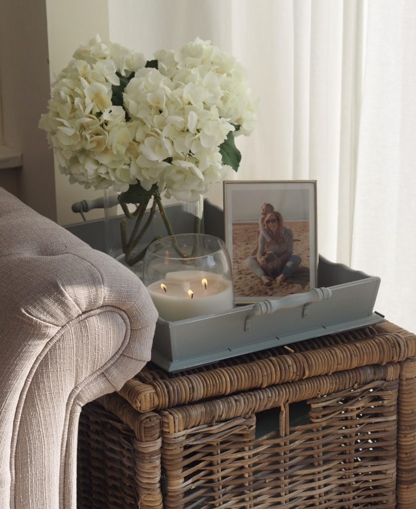
The old tray has found a home on the wicker trunk (Ikea but now discontinued…you can find similar here though) as a side table next to the sofa styled with artificial hydrangeas, a large candle & silver picture frame.
The main light fitting has been changed from a rather plain stubby cream chandelier (which was picked in haste when we were doing the extension as an electrician was coming the next day & I didn’t want anything too low so people would hit their head) to this beauty, from the Grantham range from Wayfair. As we’ve got the oversized footstool/coffee table below, it doesn’t matter how low it is!
I loved it so much that I purchased the matching floor lamp rather than the tripod look on the design which may have looked too modern.
Keeping with my neutral palette, I decided to switch up the cushions from the main mood board to ones in the alternative suggestions. Lucy did say she had an inkling they’d be too colourful for my beige loving self so had listed 12 other possibles. I reused my existing velvet beige cushions which are the 50x50cm SANELA cushion covers from Ikea for the back but added some colour with the most beautiful blush 45x45cm pink cushions from Christy. These are from the same Jaipur range as my throw & cushions on my bed upstairs so I knew they’d be the perfect tone & are the brilliant quality expected from one of my favourite brands.
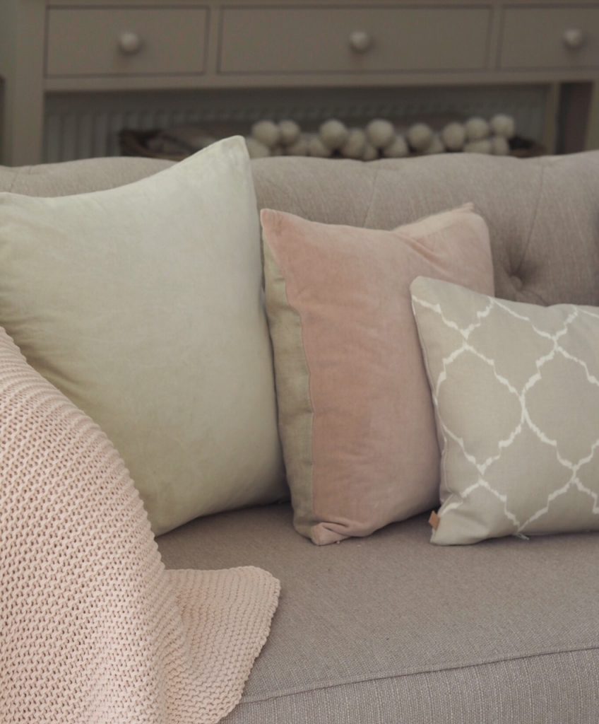
On the design, I fell in love with the grey 30x50cm cushions from Maisons Du Monde in a moroccan quatrefoil design as my statement cushion, however these disappeared from the website & despite emailing, I never heard back. In the end, Lucy found these slightly simpler rectangle velvet tassel cushions from M&S. To bring the blush pink across we added the softest throw from Laura Ashley to the armchair & this one from Ikea on the sofa to complement the cushions.
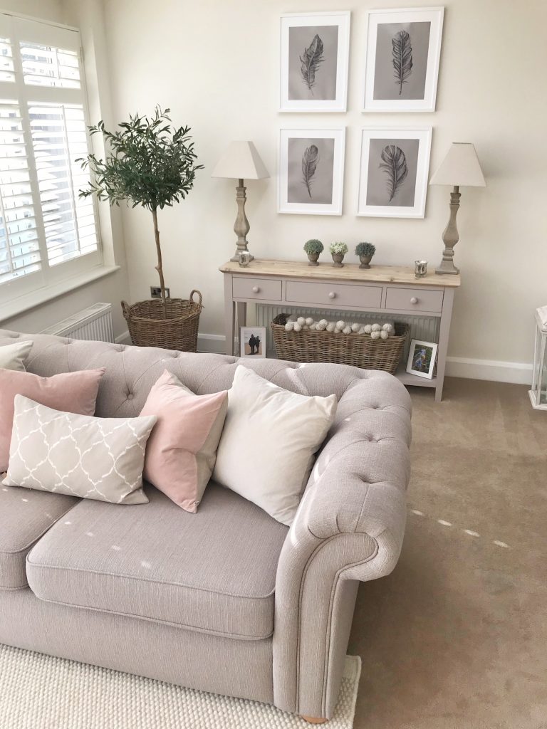
The console table wall was looking rather bare & unloved, this was the one area I was completely stuck on but the visual below bought things to life.
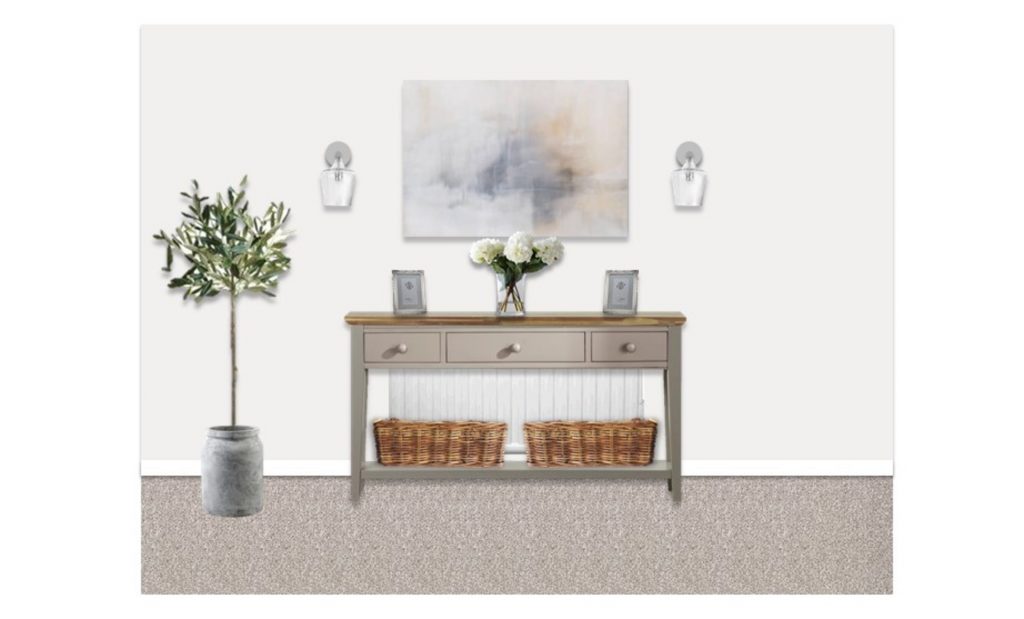
The scheme included this large abstract piece of art work which I was absolutely in love with. I’m not normally an art kind of gal but it was neutral enough to flow with the seasons & I love that the My Bespoke Room design pushed me out of my comfort zone to embrace that. Unfortunately it came damaged, wasn’t the best quality & in my rather beige room it ended up looking more blue than the images so because I wasn’t in love with it & would then have to wait for a replacement, it was returned. From Siesta Studio via Not On The Highstreet.
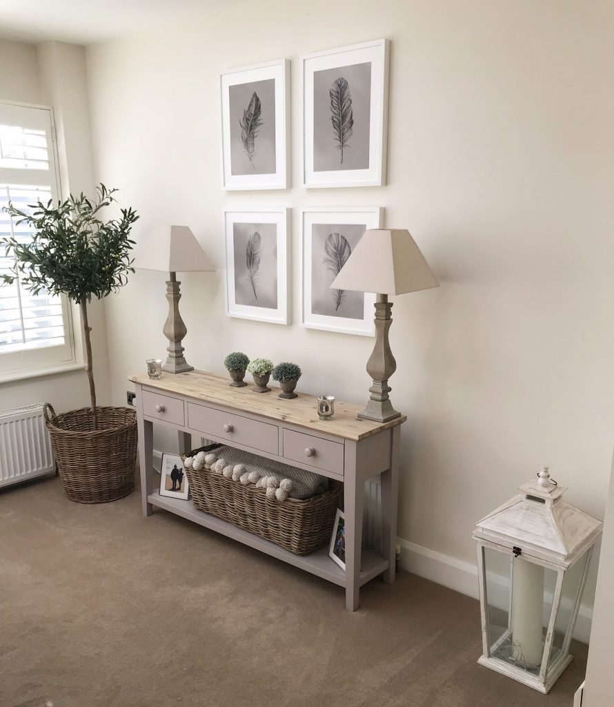
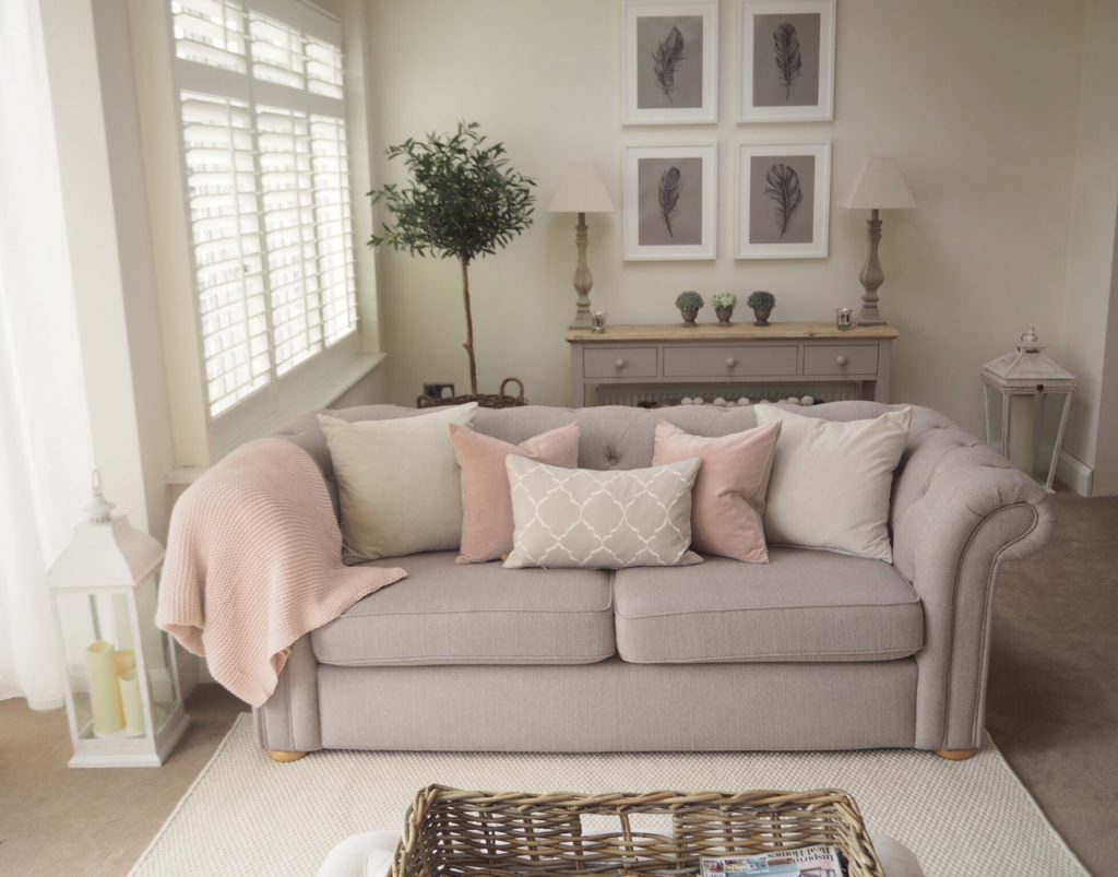
Instead we opted for these beautiful feather prints from Etsy which you can shop here, these are the A3 size. I popped to Ikea for some Ribba frames to put them in which were £7 each for 40x50cm.
The top of the console is styled with my original lamps, two little crackled silver tea light holders & these gorgeous artificial plants from Hudson Home to add more greenery. Below is a long wicker basket, again from Neptune housing all my throws for cold winter nights & silver photo frames.
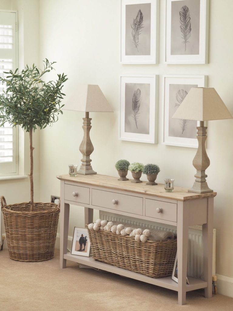
Ideally the look would have included 2x wall lights, like the Isaac from Laura Ashley, either side of the frames which I loved the idea of however this would have required an electrician to wire in & then for the wall to have been replastered afterwards so what started as under £100 would have turned in to over £500! So the original wooden lamps live to see another day, but I’ll definitely be looking in to more affordable way to achieve this….why can’t somebody invent a battery powered version?
To the left is the new addition of an artificial olive tree from Neptune Home. After asking on Instagram, it seemed that faux was the only way to go, especially as it was going to be living next to a radiator so although this was £160.00 vs a real one at around £50.00, I thought I’d probably manage to kill 3 in the space of a week with my track record as plant killer so it was a no brainer. This is sat in a wicker basket from a local shop but you can find similar here from Laura Ashley.
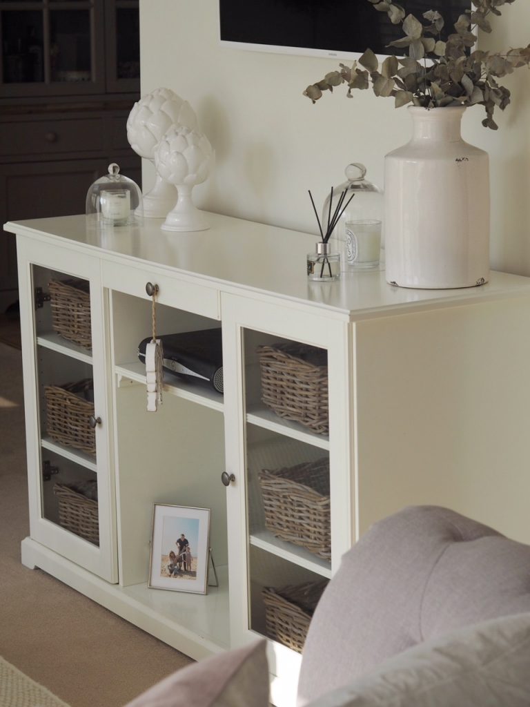
My Ikea Liatorp sideboard/TV cabinet has been restyled with accessories I already had – got to love a faff/shuffle. The wicker trunk has been moved to next to one of the sofas to double up as a side table. This was originally Ikea but has been discontinued. You can find similar from Wayfair though here.
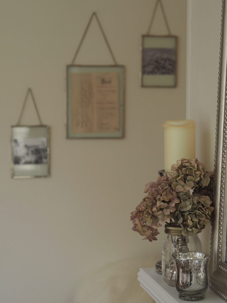
Finally, we created a feature across the room above the armchair using these hanging photo frames from M&S by displaying the deeds of Baylyn House dating back to 1882 along with two old pictures of Christchurch.
You can shop my look here –
I am so over the moon with the new look of the room & it just goes to prove that accessories & soft furnishings completely make a space. My Bespoke Room have done the most amazing job; I feel like they understood my brief, followed it through with my feedback & executed perfectly. I would never have chosen some of the items without their guidance which just goes to prove that you can always learn from other experts in your field! I honestly couldn’t recommend them enough.
They’ve generously given my followers & readers 10% off any design packages until the end of April using code ‘THTMM10‘. Alternatively, if you want to get a bit of interior inspo & shop the look of previous designs they’ve created then visit their inspiration page here for real homes….think of it like a Pinterest board that you can actually shop. Keep your eyes peeled for a fun post coming up soon with some of their designers at Baylyn House! Love,
*This is a collaborative post with My Bespoke Room & may contain affiliate links

Amazing look
And thanks for all the tips and advise
Got to get cracking?
Charlotte I love it! I love the detail and thought that’s gone in to this it looks great! It’s so nice seeing your style evolve – I am continually doing the same and I think you have perfected managing to update without losing your core look. Fantastic! X
Wow wow wow! It looks beautiful (it was lovely before also!) I love you post blogs and honesty! Since following you last September, I have totally restyled my house and truly love my home after 12 years! Please keep doing what your doing your are fantastically inspirational and truly lovely person.
Thank you
It’s perfect! I could only dream!
Hi
Room looks stunning. – amazing what a few tweaks can do. I have learnt a way you can put up wall lights without needing them to be hardwired. You buy these battery operated remote controlled push type lights from Amazon – an instagrammed called Brooke from Nesting with grace shows how to attach them to the inside of the wall light with Velcro sticky pads or twist on with wire. Bingo – no electrician needed! https://www.amazon.co.uk/dp/B0769FG2GQ/ref=sspa_dk_detail_0?psc=1
http://nestingwithgrace.com
Thanks lovely – I actually follow her already & have seen the trick but as we use the lighting all the time (mood/side lighting rather than main ceiling) I’d be going through batteries like it was going out of fashion xx
Wow, the room looks beautiful! I love the subtle nature of the transformation – simply gorgeous!
Hello, Charlotte! Your house is so beautiful.. Keep on posting pictures. Just like you, I am also obsessed with interiors and love love neutral style. You’re an inspiration.. ahh I can only dream for now..
Beautiful calm classy room – love it.
Can I ask where the fire log electric fire is from please – its so nice.
Kind regards and thank you for inspiration.
Looks gorgeous, can you tell me what colour the wall paint is please
It’s Dulux ‘Almond white’ lovely x
Hi I love your home Charlotte . Could I ask if you had the print with the border or not as I really want to order 3 of them and get the Ikea frames you have put them in many thanks Claire x
Hi Charlotte,
Your house is beautiful. Please could you tell me where your footstool is from?
Xx