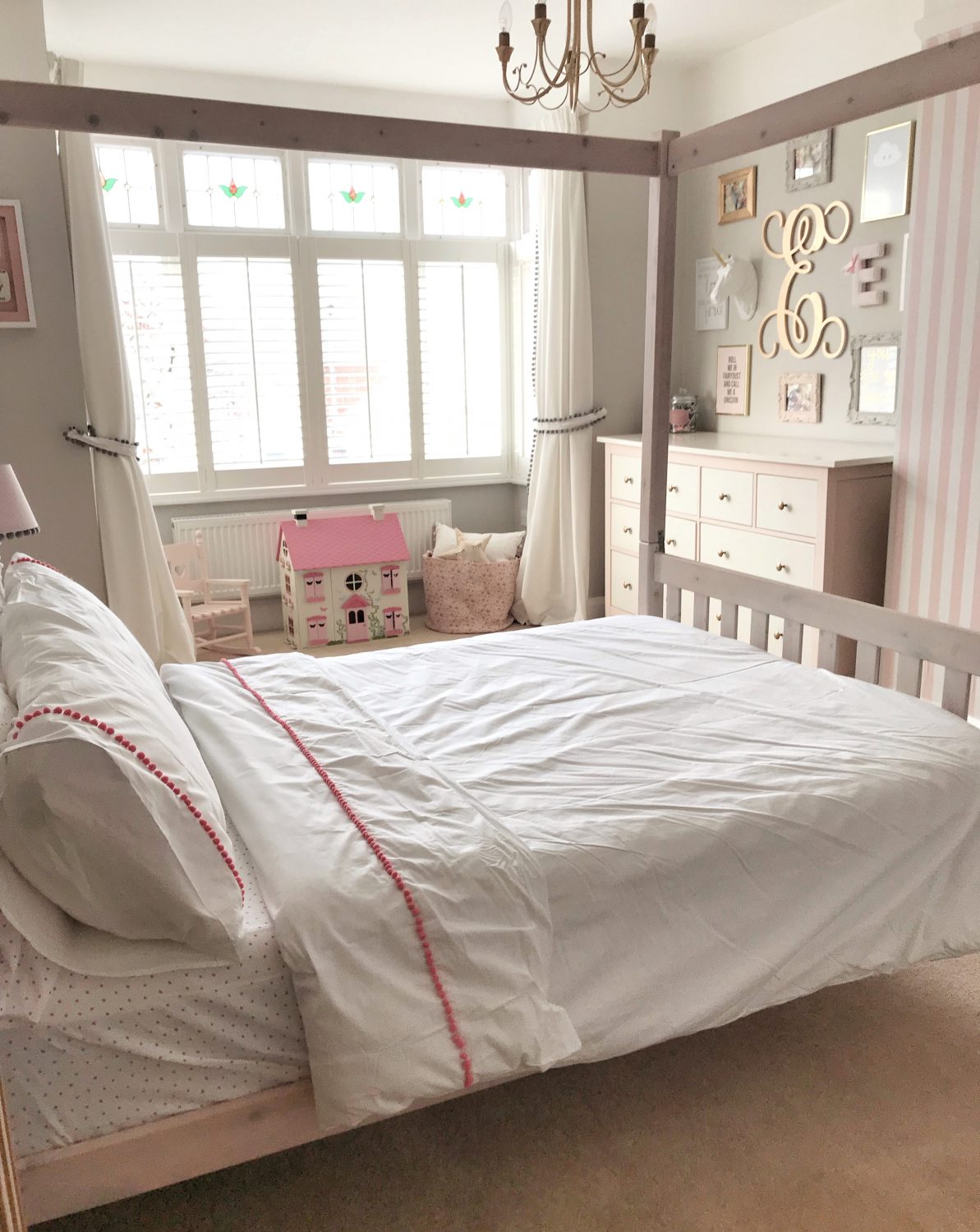
Your little poppets bedroom is the one place they’ll probably spend more time than any other considering they sleep for up to 15 hours per day so it’s really important to make sure they have the surroundings to rest, rejuvenate & take on the world.
When designing a child’s room, it’s really important to take every aspect in to consideration to make sure they get the most from it. Typically I would say that a bedroom needs to be as relaxing as possible; somewhere you feel instantly calm, however for children, their bedroom usually doubles up as a place to play & do completely the opposite so when it comes to interiors, it can be a tricky one.
I’ve teamed up with Christy for the launch of their brand new children’s bedding collections ‘Christy Junior‘ to bring you my top tips on how to get the balance right as well as showing you some beautiful products from the new line, available in 3 sizes being cot bed, single or double (which is incredible as I struggle to find bedding for Elsa’s double 4 poster that isn’t too grown up!).
So what rules should you follow when designing a room fit for a little Prince or Princess?
Inject some fun –
Your little ones room should be a place that they love spending time – so make it fun!
To make Elsa’s room a bit more ‘her’ I decided to incorporate a dressing up area as it’s one of her favourite things to do. She has a dressing up rail full of Disney Princess dresses, a box full of accessories like those little plastic high-heels, tiaras, wands, fairy wings & so on then a huge mirror to get ready & dance in front.
For Rory’s room, I went for painting his built-in wardrobe doors in chalk board paint which added a fun twist to an otherwise plain area.
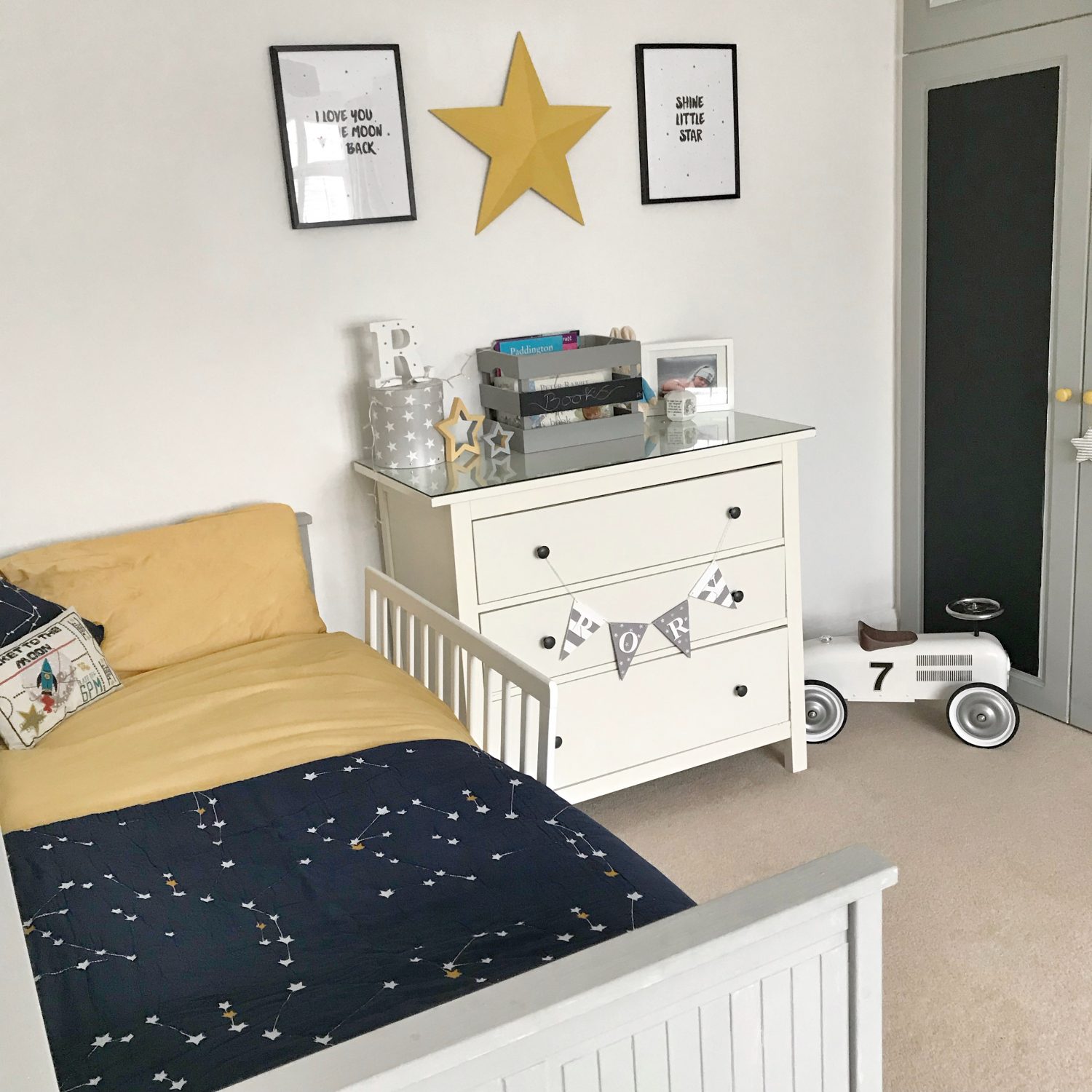
The amazing thing about children is that they have the best imaginations going & can easily turn a pile of cushions in to a fort or a throw in to a den! Your job is to enable their room to be part of this.
Embrace the theme –
Normally, I’d say that themes within interior design is a big no-no but when designing for little ones it definitely needs to be embraced. You can be as fun & quirky as possible which sometimes makes them the best rooms to get your hands on! That being said, bare in mind that they also change beyond belief too as their little personalities start to come out & shine. Your baby will turn from a little goo-ing newborn to a dinosaur obsessed beast in no time at all so don’t go too overboard. Use soft furnishings to give the room a look rather than spending hours on a wall mural or expensive wallpaper which may not be ‘in’ within a year.
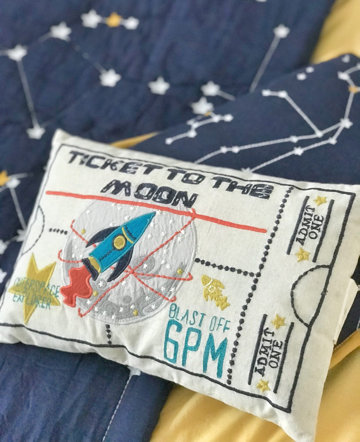
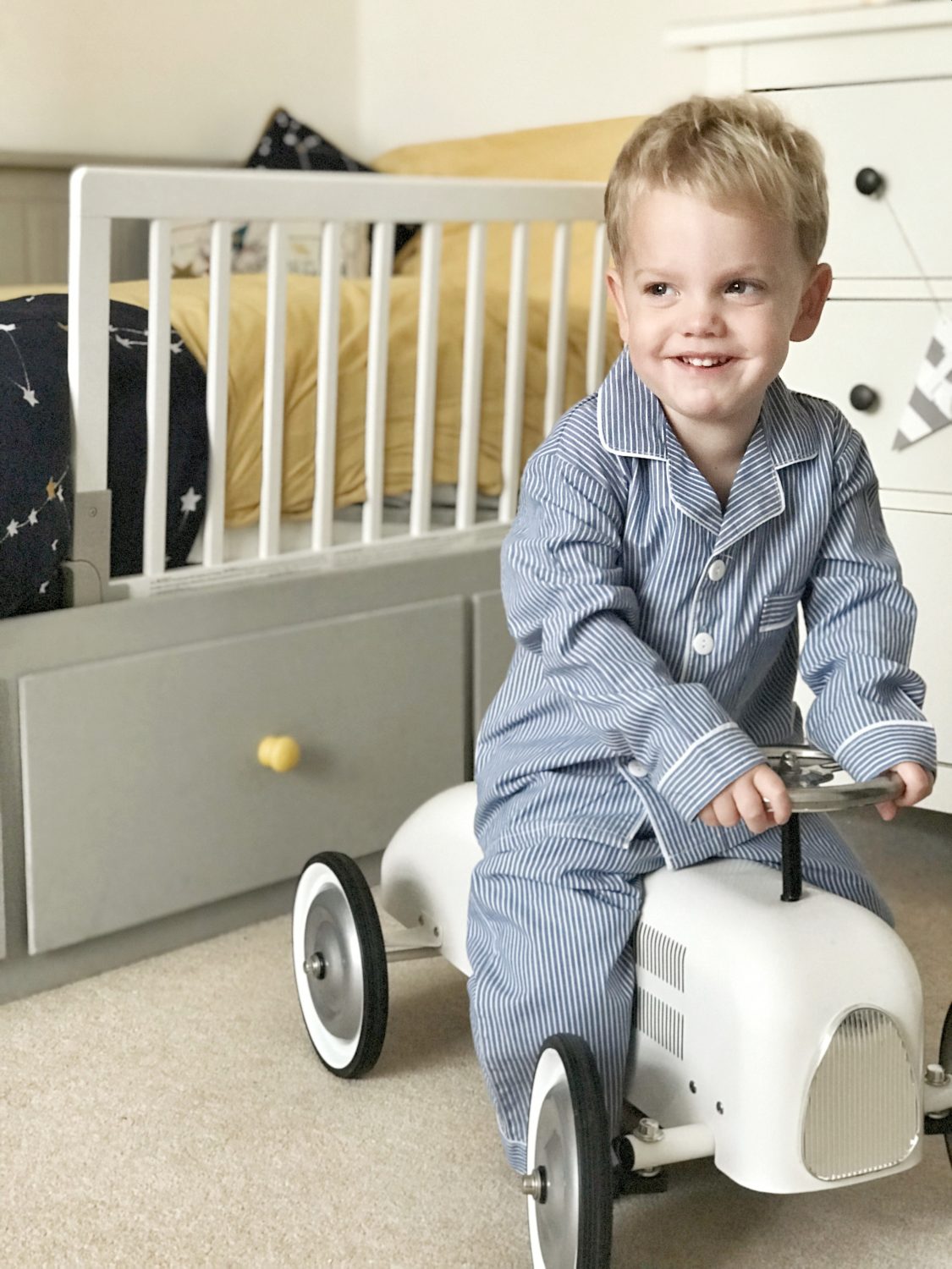
In Rory’s room, the theme has been ‘grey & mustard with stars’ for a while now & I love it! The pops of mustard bring a new element to the space. Christy have outdone themselves with ‘Rory’s room‘; space themed using deep, dark colours which are taking the interior design world by storm. We already had a grey & mustard theme in Rory’s bedroom but adding in the ‘Cosmos‘ throw with it’s dark navy, embroidered constellations & mustard edging was the perfect match. For a fun, quirky twist the ‘Ticket To The Moon‘ cushion.
It’s all about storage –
How does one little human need so much STUFF?! That’s why storage is so incredibly important when designing a child’s room so go for furniture options with dual usage; beds with drawers (Rory’s Ikea bed not only has 3 huge drawers but also pulls out to become a double for sleepovers!), toy boxes that double as seating benches & so on. If you don’t have the floor space then sometimes going vertically is a great idea with raised bunk beds with desks underneath or space to play. Think baskets, boxes & shelves.
Let it grow with them –
It can be all too easy to design a room for here & now, but children grow up so quickly that sometimes it feels like you blink & they’ve shot up. Unless you want to redecorate every couple of years; go for a timeless look which isn’t too ‘babyish’ so that it can be adapted to them & they won’t grow out of it too quickly.
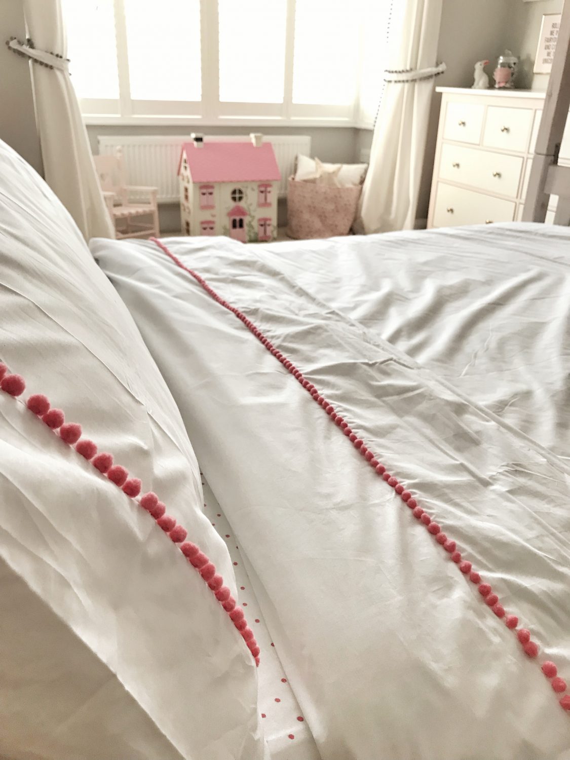
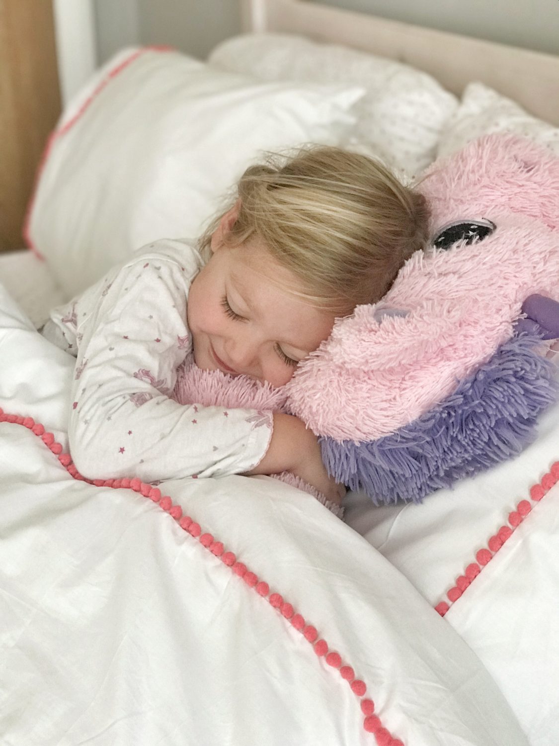
For your little Princess, Christy’s designers have hit the nail on the head for this years nursery interior trends in ‘Woodland Trail‘, inspired by nature but oh so sweet & girly. A mixture of delicate vintage print florals, lady birds, polka dots & obviously my favourite the pom pom bedding of dreams in the coral ‘Willow‘ duvet set. This range is beautiful but also neutral enough to be loved for years to come.
Comfort always comes first –
It may be an obvious one but always make sure to invest when it comes to the place we spent the majority of our time; our beds. Children need a lot more sleep then adults & considering the amount of energy they use up when they are awake (serious question, do they ever sit still?!), it’s SO important to make sure they are getting the best quality sleep possible to wake up feeling fully recharged.
Invest in a good quality mattress & even better bedding. The ‘Speckles‘ dotty range made from 100% cotton jersey fabric is sure to lead to a super soft & snuggly nights sleep.
Keep it relaxing –
Remember, the main function of this room is to rest & sleep so using bold, bright colours is only going to have the opposite effect. Make it so that it can be a fun space when they are awake but can easily be shifted to a calming area; toys should be easy to tidy away out of sight & walls should be kept in neutral tones.
Make it personal –
I cannot express this enough; the best room designs are ones that are personal. Anybody can chuck together a design with items from a catalogue but making the space in to a room that suits your little ones personality is the hard part. What are they interested in? What do they like doing? If you’ve got a tiny Picasso in the making then hang their art work from hooks so they can be proud of it, if your child loves reading then create a little book corner. If your child has special memories or favourite pictures then these can be used within the design too like framed tickets or popping things on a magnetic memo board.
Room for activities –
As one of the most quote worthy films of all time says, you need ‘so much room for activities!’. Make use of what room you have but also make sure that you leave enough floor space to allow for charging around like a superhero!
Love,
*This is a sponsored post

Hi Charlotte. Where did you get the pom-poms for Elsa’s curtains from?
Thanks
Hi,
I’m very new to your blog and love it!
Where did you get the giant gold E for Elsa’s room??