
With new homes offering a blank canvas, the choice of colours is one of the most exciting aspects of personalising your space. The right colour scheme can transform your newly built home into a welcoming and stylish sanctuary that is tailored to your unique tastes. But with so many options available, it can be tricky to know where to start.
This guide will help you create a colour palette that reflects your style and enhances the overall ambience of your new home.
Why colour matters in your new build home
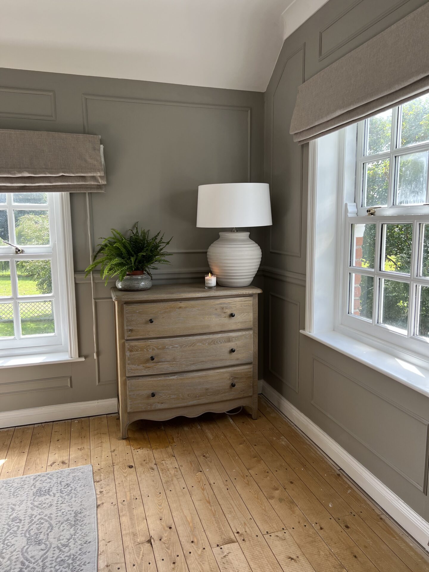
Colour can make a home feel larger, smaller, warmer, or cooler. A well-chosen colour scheme can create a sense of harmony and cohesion throughout your home, while a poorly chosen one can leave you feeling unsettled and uninspired.
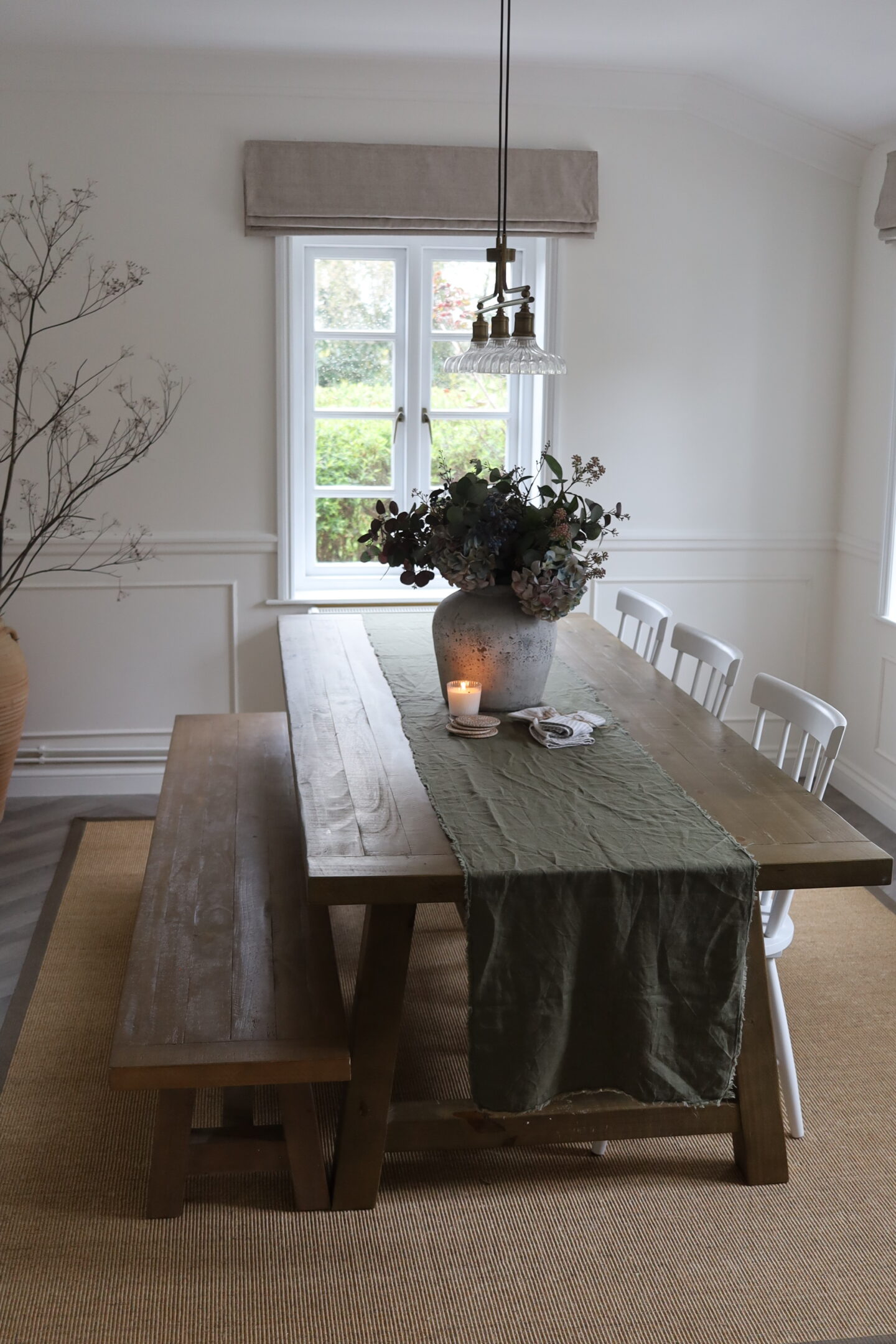
When selecting colours for your new build home, consider your lifestyle and preferences. Do you want a calming and relaxing atmosphere? Or do you prefer something more vibrant and energetic? Think about the overall mood you want to create in each room. For example, a child’s nursery would be complemented by primary colours such as yellows and reds, while a bathroom may be better suited to gentle shades of grey or blue.
Harmonising with natural light
Natural light plays a significant role in how colours appear in your home. Rooms with abundant natural light can handle bolder and darker shades, while rooms with limited natural light may benefit from lighter and brighter tones.
- North-facing rooms: Consider warm tones like yellows, oranges and reds to compensate for the lack of sunlight.
- South-facing rooms: Cool colours like blues, purples and greens can help balance the abundance of sunlight.
- East-facing rooms: Warm tones in the morning and cool tones in the afternoon can create a dynamic atmosphere.
- West-facing rooms: Create a cosy and inviting ambience with warmer shades.
Neutral vs bold: Finding the right balance
A neutral colour palette can create a timeless and versatile foundation for your home. White, cream, grey and beige are popular choices. However, adding pops of bold colour can add a touch of personal flair.
- 60-30-10 rule: This popular design principle suggests using a dominant colour (60%), a secondary colour (30%), and an accent colour (10%).
- Focal point: Consider using a bold colour on a feature wall or piece of furniture to draw attention.
- Accessories: Introduce bold colours through accessories like throws, cushions, artwork or rugs.
Incorporating current colour trends without sacrificing timelessness
While it’s tempting to follow the latest colour trends, it’s important to choose colours that you’ll enjoy for years to come.
Consider timeless classics like navy blue, olive green and mustard yellow. If you want to incorporate a trendy colour, use it sparingly as an accent.
Colour continuity
For a cohesive look, consider using the same colour palette throughout your home. This doesn’t mean every room needs to be identical. Instead, you can create variations by using different shades or tones of the same colour.
- Flow: Ensure colours flow seamlessly from room to room.
- Hallways: Use hallways as transitional spaces to connect different colour schemes.
- Open-plan living: Create a unified look by using similar colours in open-plan areas.
Love,

* This is a collaborative post