Hello & happy Friday….these Home Tour Friday posts are really making me realise how quickly the weeks are going & I can’t believe we’ll be moving upstairs soon. Remember I’m looking for your homes to feature when the posts on Baylyn House are complete in a few weeks time so if you have a house/room you want to show to the world (well, to my 112k Insta followers…) then please do drop me over an email.
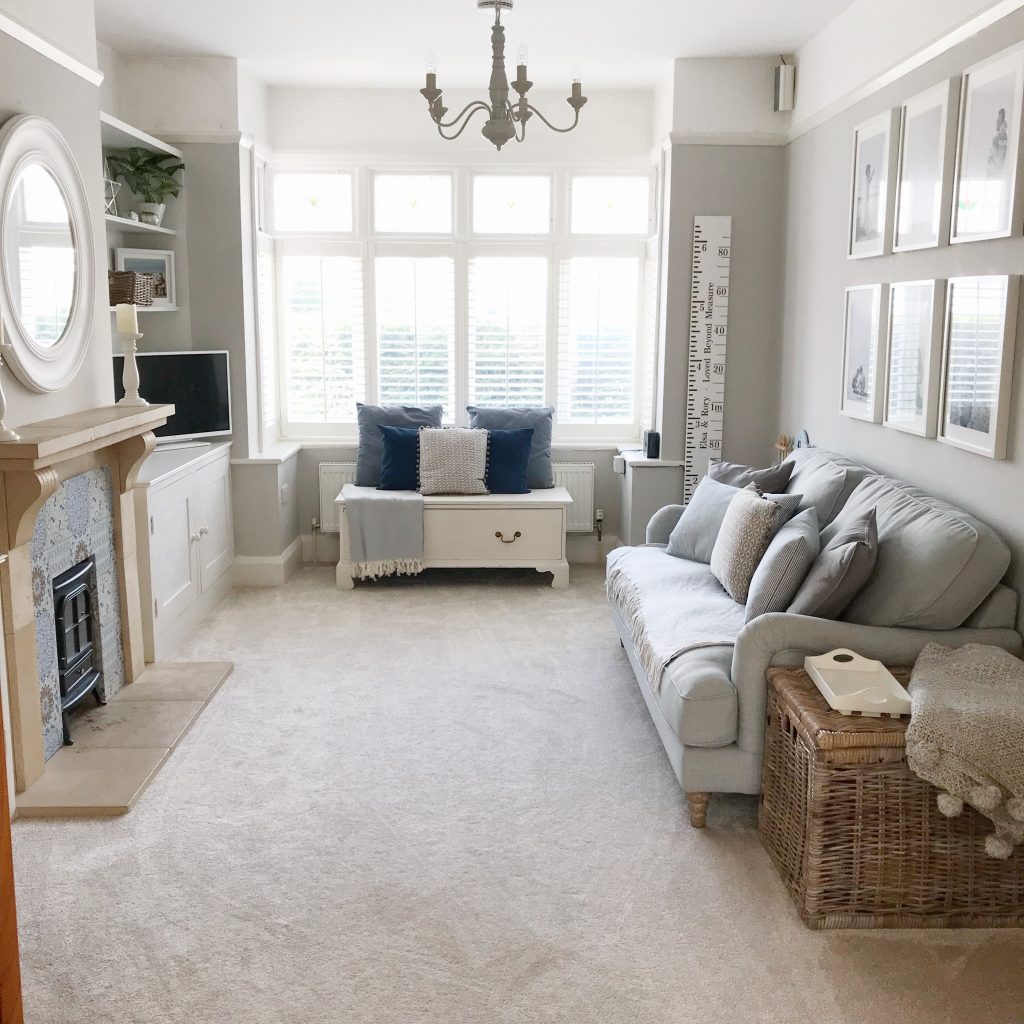
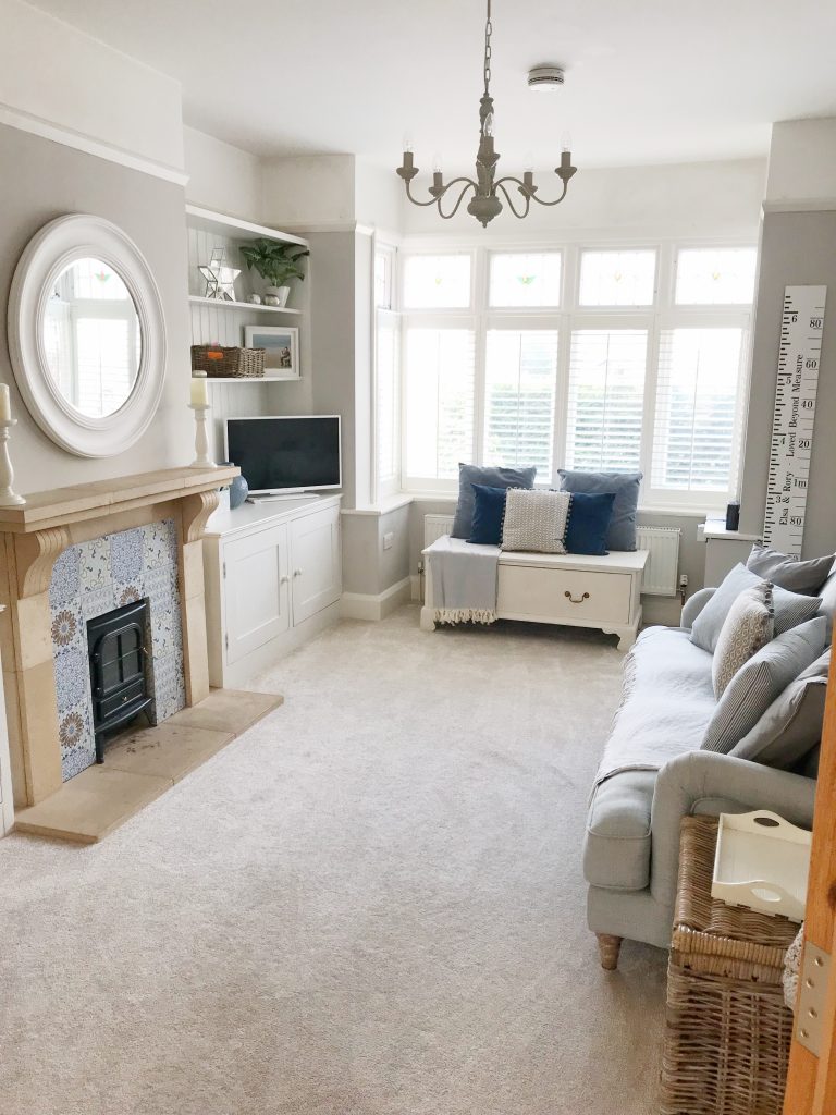
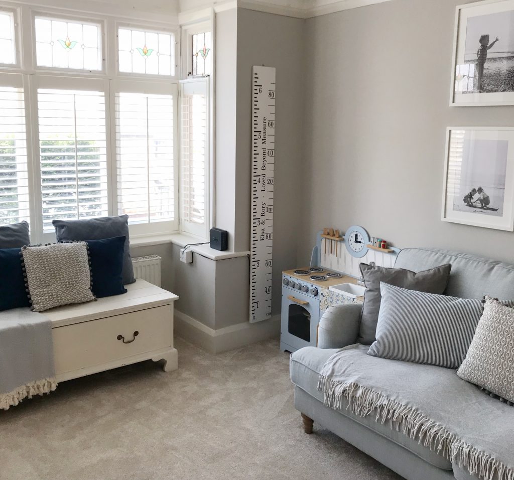
This weeks tour is focusing on the playroom. For many, a room of doom & sometimes not always the prettiest when laden with mounds of noisy, brightly coloured plastic toys. We’ve tried to design it to stand the test of time & be practical yet pretty for them as they grow & their needs change. A snug that we can use as well as a playroom.
Originally the dining room before we completed our conservatory turned extension living room; having an extra room purely for the kids is an absolute luxury but now, I don’t know how I’d ever cope without it. It is definitely a lifesaver when it comes to keeping things tidy & means the ‘grown up areas’ stay grown up & I don’t have to watch 329823847 episodes of Paw Patrol when I want to watch Homes Under The Hammer or Location Location Location (trashy daytime TV for the interior obsessed…).
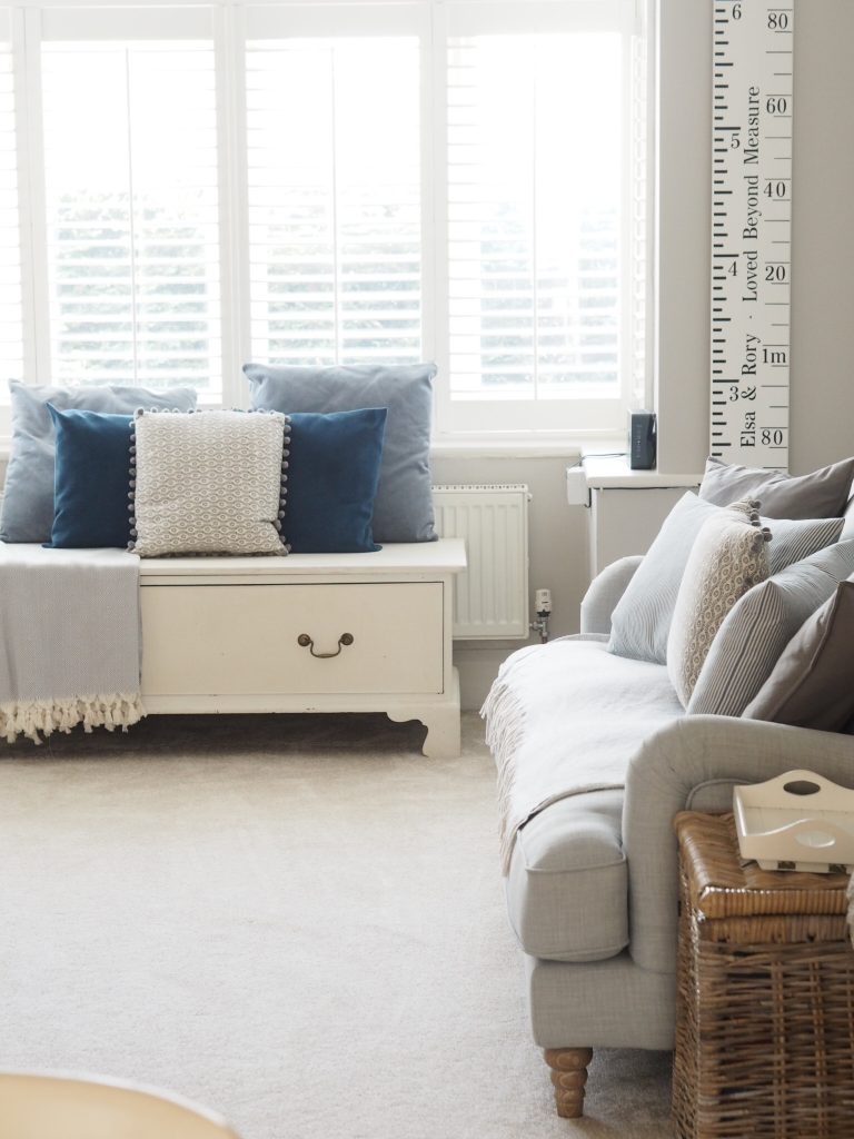
The walls are painted in Farrow & Ball ‘Cornforth White’ which is the only grey I ever recommend to clients. If you’ve ever tried to paint a room grey, you’ll know how incredibly hard it is to find a paint that’s a ‘true’ grey & doesn’t end up looking blue or purple. I’ve spent so much money on testers over the years! It’s such a gorgeous tone that doesn’t feel too cold & isn’t too dark that it makes the room feel small. I love it so much that I’ve also painted Elsa’s bedroom in it upstairs.
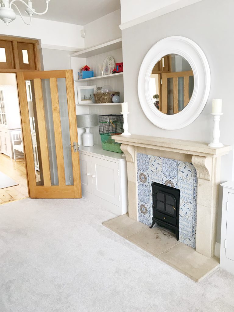
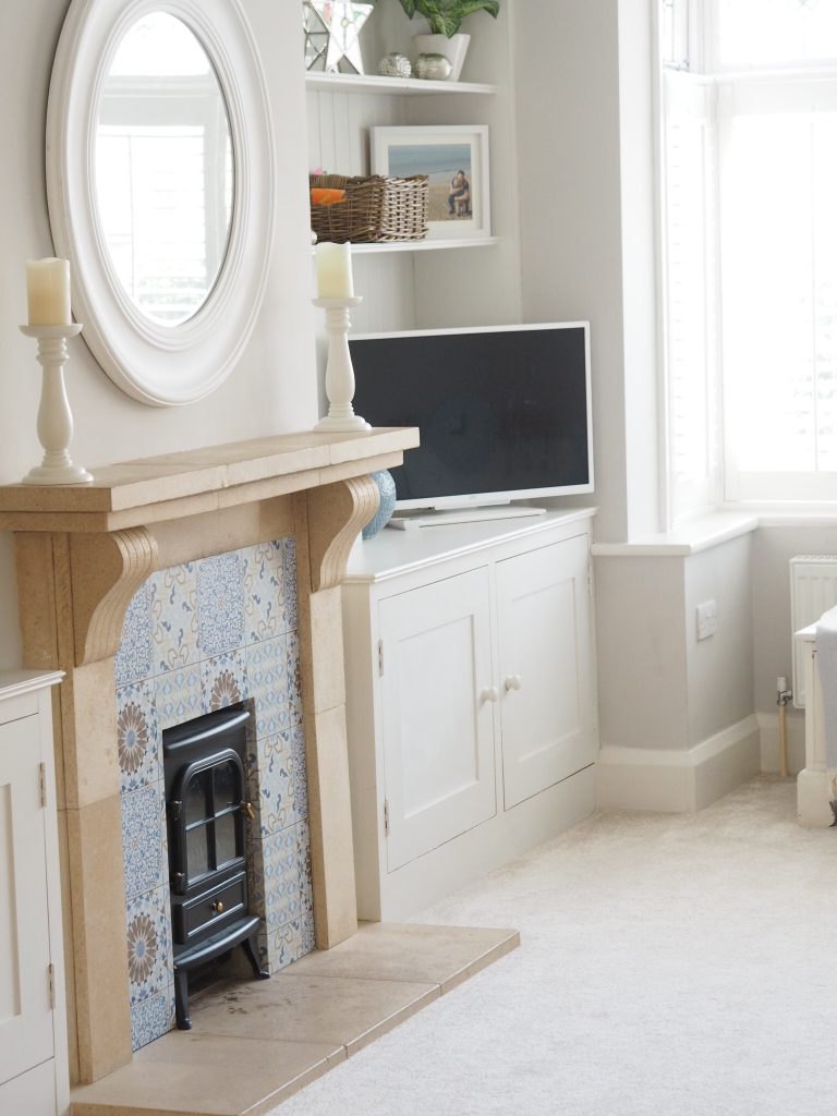
We had built in wall units put in by a local carpenter last year, these were designed to look as traditional as possible & back in the Victorian era when Baylyn House was built, something similar would have probably sat either side of the chimney breast as they do now but over time they’ve been removed. They are absolutely ideal for storing all their toys with ease (although we have lots of clear outs & donate to charities so they don’t have too many if I’m honest…) & made of MDF to save money. The back has been cladded to provide interested & texture & finally were painted in F&B ‘Strong White’ which is a grey white to tie in the wall colour in estate eggshell which is super hardwearing for all those dings from scooters riding into them & grubby chocolate covered handprints.
We encourage the kids to be creative & Elsa is constantly drawing so we have lots of bits stored in a little art station with these Great Little Trading Co star print caddies.
The lamp was actually from The Range but is very similar to this one from The White Company. The picture frames on the dressers are also from The Range & match the Ikea Ribba ones well if you don’t have one locally (& are very reasonable..).
We added a new addition to the family a month or so ago in the form of a little fluffy beige (obviously…) hamster called Herbie. He lives in here in his cage which doesn’t exactly fit the aesthetics but we love him so I’ll let him off.
On the right hand unit, we bought a 32″ smart TV. The kids can watch Netflix on it directly which they love as well as their huge stash of Disney DVD’s without faffing around. Plus it’s white so as much as as a TV is a necessity, they aren’t the most attractive of things so this helps blend it slightly better.
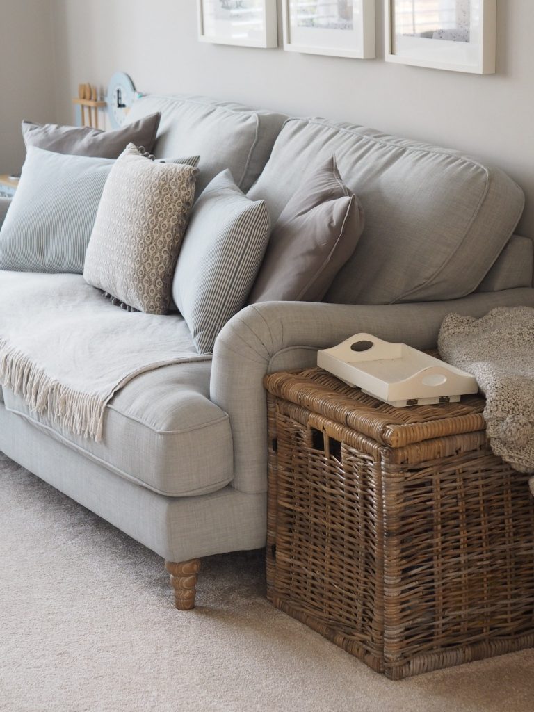
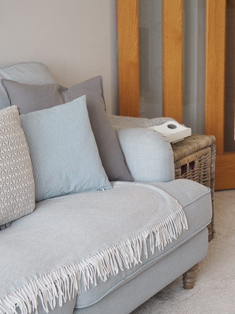
The sofa was a bargain find from Dunelm. An employee marked it down from £700 to £200 whilst I was browsing around before I’d even begun planning the decor; far too good an opportunity to miss so I was running to the till before anybody else could get their grubby mitts on it without a second thought. It inspired me to use the blue within the room which I probably wouldn’t have otherwise done. I’m not sure if it’s exactly the same as this one but it’s similar to the ‘Bella’ on the Dunelm website here. Mr THTMM wasn’t exactly impressed when I called him to tell him I needed him to borrow a car & bring the trailer to come pick it up….ooops.
I keep a throw over the sofa to stop as many stains as possible although the covers are removable/washable so they sometimes get bunged in the washing machine. The cushions are Ikea (grey & striped) & Homesense (patterned/pom pom).
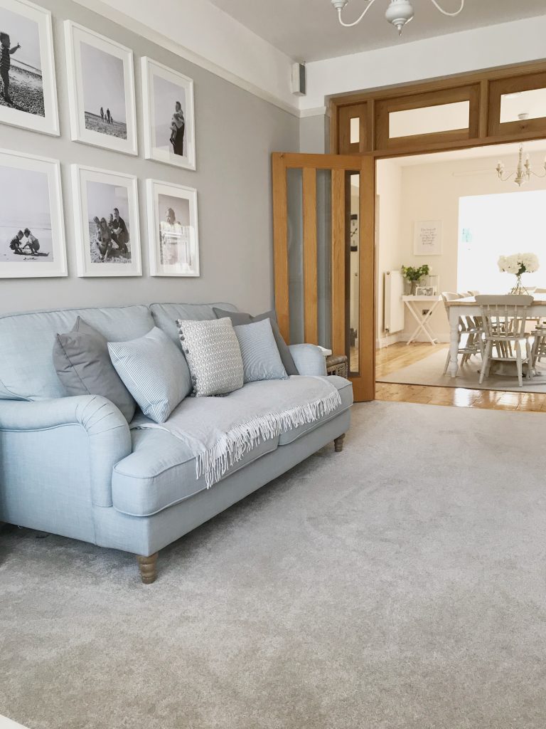
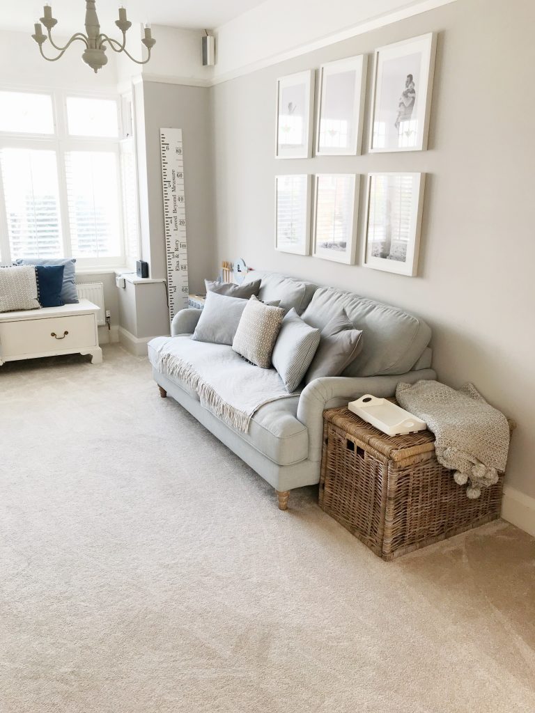
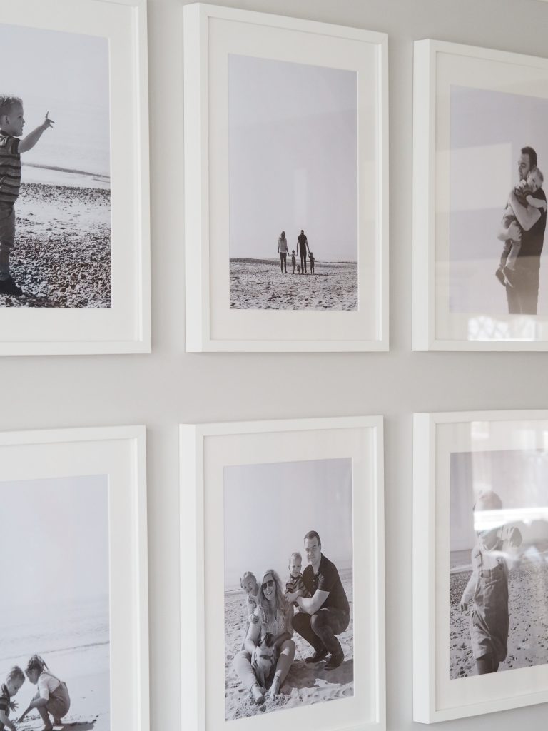
Hanging over the sofa are 6x large Ikea Ribba frames (size 40X50CM) which are filled with black & white photographs of us at the beach last year from the oh so talented Charlotte Marie Photography who’s done our newborn & wedding shoots too. I absolutely LOVE these & they make me smile every time I look at them…if you haven’t had any family snaps taken then you really should.
I get asked about the wicker storage trunk all the time & it was from Ikea however has unfortunately been discontinued but you can find similar from Amazon here. I also have one in my living room & always say how they are like Mary Poppins bag, the amount of stuff you can fit in is crazy plus the top comes in handy as a little side/coffee table.

Inspired by the sofa, I looked to bring some pops of blue to the room & came across all surface sticker from Pixers. This is the same as used in my office as a wall feature however this ‘Pixerstick’ technology means it sticks on to virtually anything including fridge/freezers which gave me an idea for a bit of a fireplace makeover. I found this ceramic tile design which I immediately fell in love with considering how much I LOVE patterned tiles. As with the office, it was super easy to install as you can easy take it on/off (without any damage hence why I’m such a big fan as I don’t like the commitment of actual wallpaper/tiles for someone like me who constantly changes things!). It was black granite before.

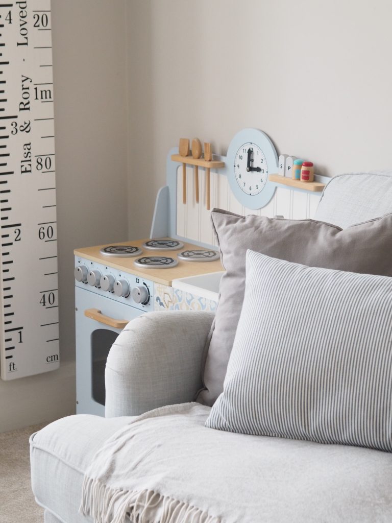
Waste not, want not so with the bit that was left over from the middle section, I also gave our play kitchen a bit of a makeover to match!
Fletcher & Mils created a personalised height chart ruler with ‘Elsa & Rory – Loved Beyond Measure’ to add a personalised touch. We mark their height on their birthday each year to see how they’ve grown.
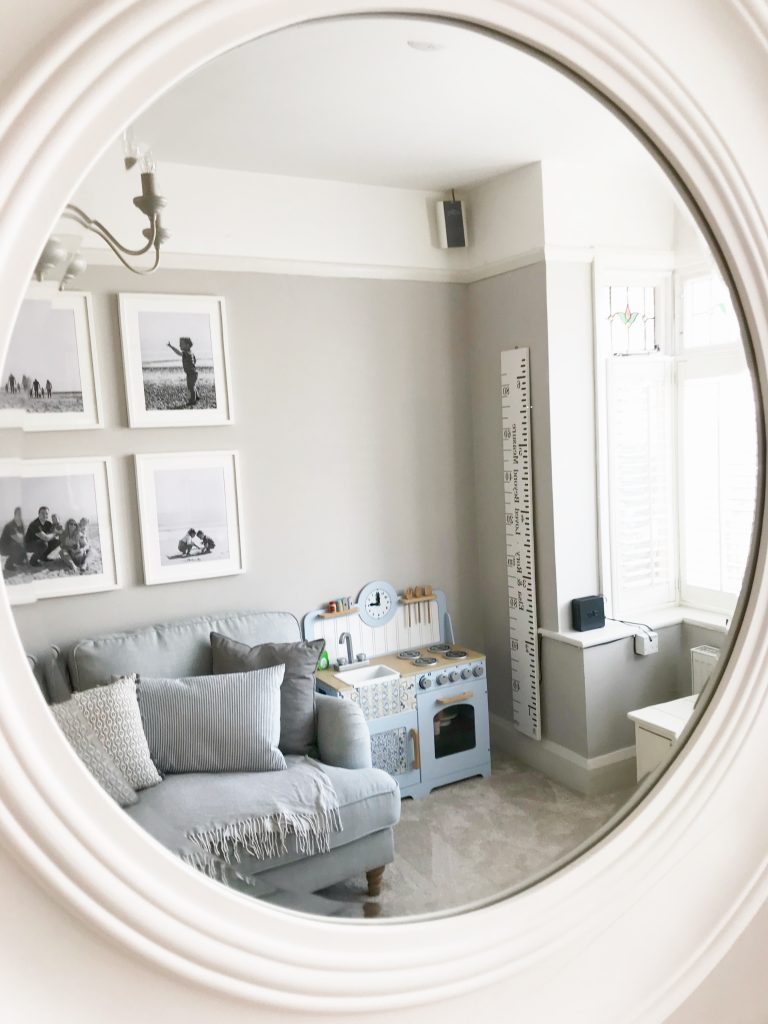
Over the fireplace is the 36″/90cm Rebecca Grande which acts as a real statement & would suit either contemporary or period styles perfectly.
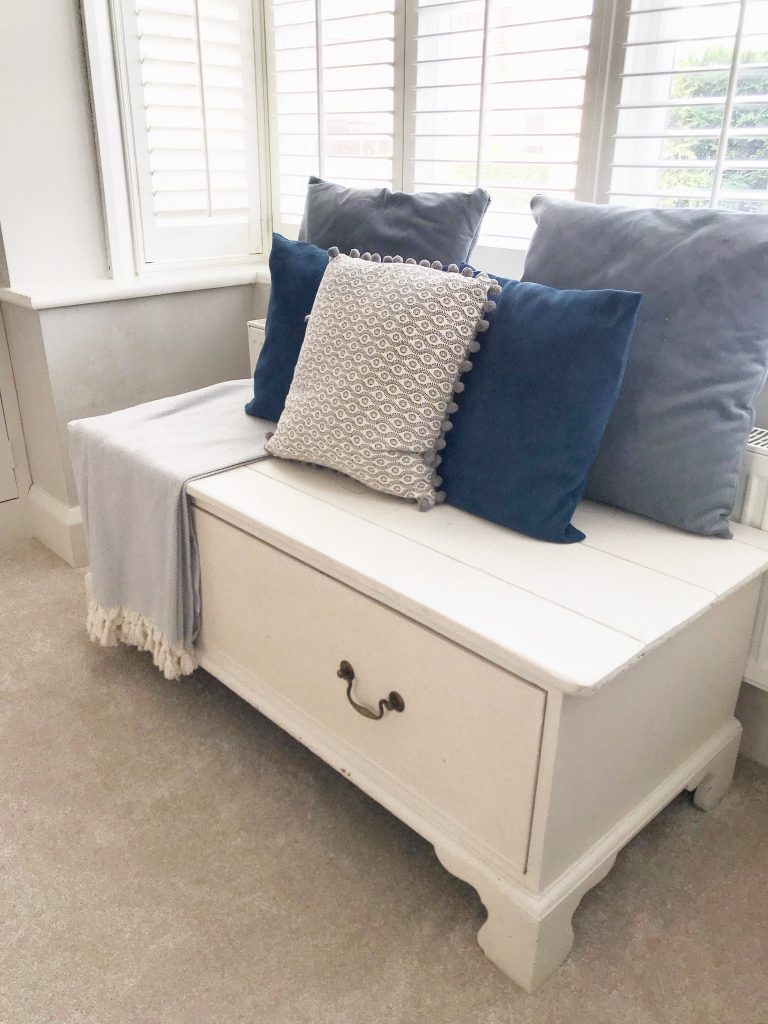
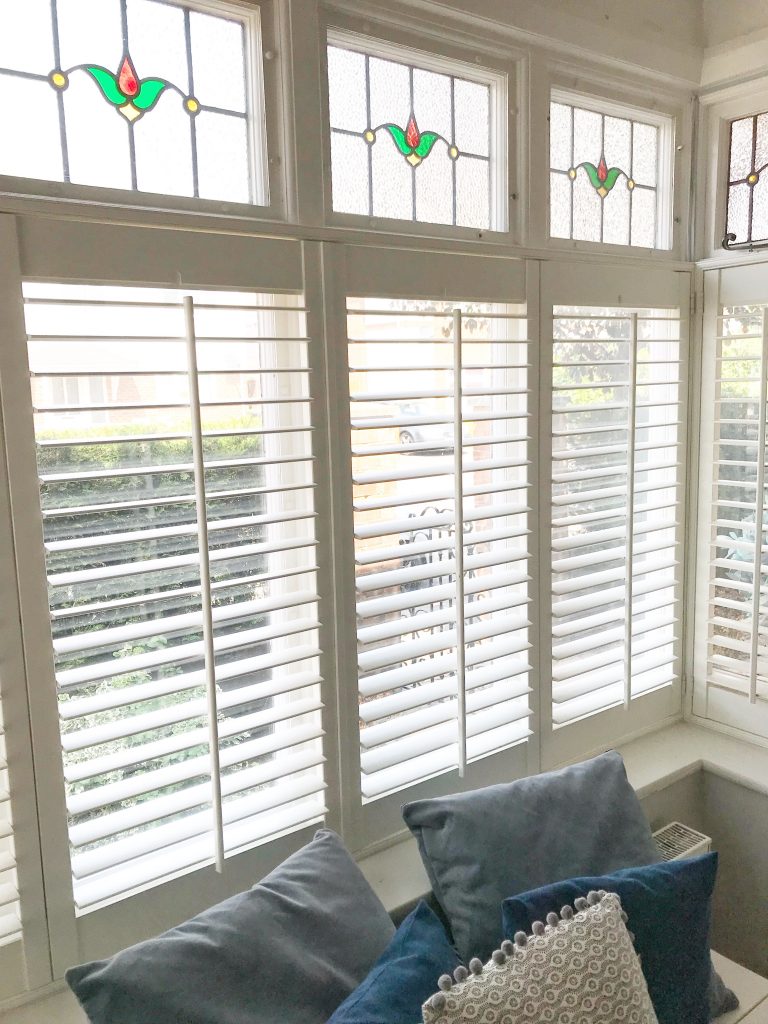
The upcycled window bench has more art & craft bits inside. You can never have too much storage! It was painted in Annie Sloan ‘Old White’ & the cushions are a mixture of Ikea & Homesense.
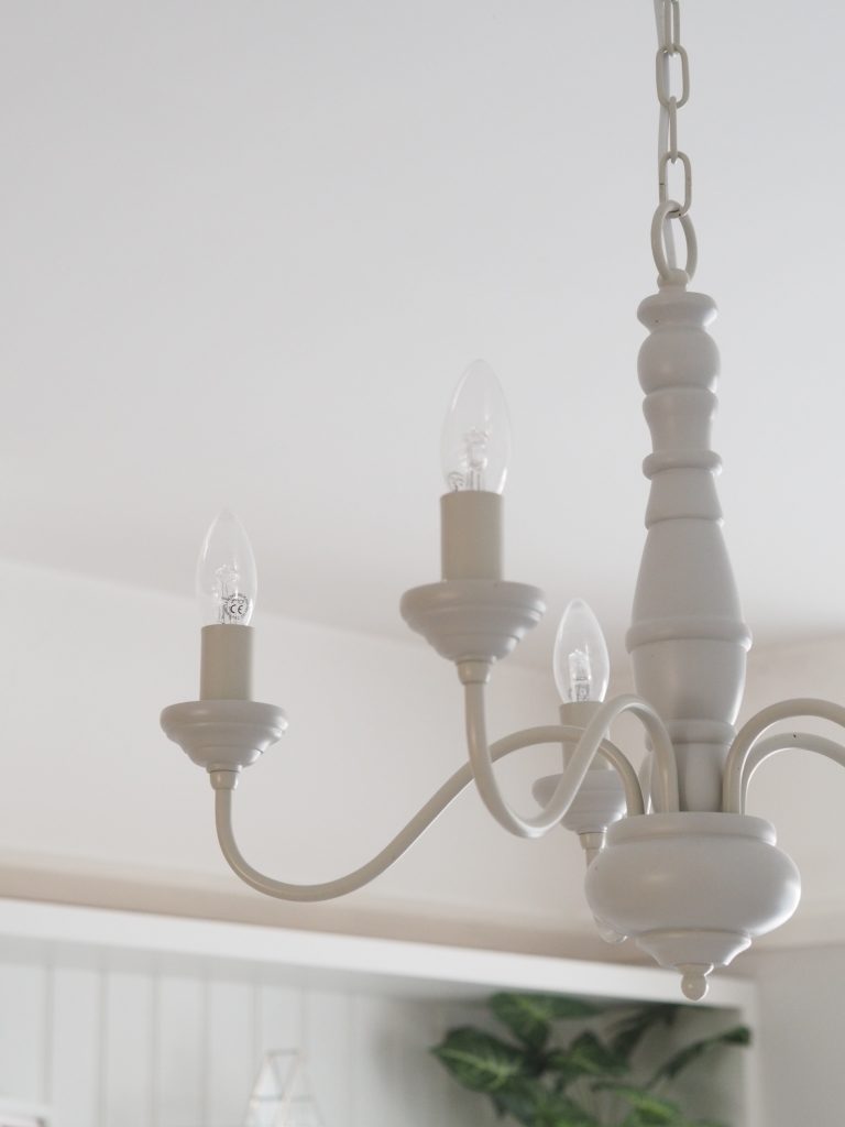
Finally, the light fitting is the same chandelier as in the dining room to tie the two rooms & also keep it looking traditional. The Milnsbridge from Laura Ashley.
Next week you’ll be getting a 3 in 1 post with the utility room (which I never show on here as it’s not the utility room of dreams but more a dingy pit of washing machines…), downstairs WC & my office AKA The Home That Made Me HQ.
Until then, have a lovely weekend!
Love,
*This post may contain affiliate links

Looks gorgeous! Do you use the fireplace? I’m really interested in these tiles but just wondered if they’re heat resistant?
Thank you!
It’s just a little electric one for decoration really so we put it on but it just blows out rather than gets hot. I doubt they’d be heat resistant for a real fire x
Hi Charlotte, I’d love to have my home featured please, I adore your home and take lots of inspiration for your decor, but our ethos is very similar in that you can still have a gorgeous home despite all the stuff that accompany kids!
Let me know if you’d like to see pictures.
Love Lauz x
Hi Lauz, oh thank you so much! Do send some over to thehomethatmademe@gmail.com x
Hi Charlotte,
Love love love your home. Is your carpet a stain resistant one in case of paint or crayon marks?
Thanks
Carol
Hi Carol, I think most modern carpets are fairly stain resistant/cleanable! We’ve never had any problems x
Hi Charlotte, just wondering if it’s just white above the picture rails or is it the strong white?
It’s brilliant white – same as the ceiling x