Our bedroom is the one room in the house that we haven’t touched much & recently I had been feeling a bit bored of it. Considering it’s the first space I see in the morning & the last I see at night, I really wanted it to be as inspiring as the other rooms in Baylyn House.
When we moved in over 3 years ago, I was 8 months pregnant & had a month (to the day!) before Rory was born to get as much done as possible. The master bedroom was one of those rooms that was to be honest quite rushed & we basically decided to bring across the look from our old house (as we hadn’t decorated long before) as it was easy, safe & the most affordable option.
Click HERE to see all the ‘BEFORE’ shots. It’s crazy how I always thought it was nice before but now….well, I look at the photo’s compared & it doesn’t even compare!
Inspired by my living room revamp a few months ago, I realised that you don’t have to completely change everything in a room to give it a new look & I still loved the paint colour as well as most of the furniture so the plan was to change things up by just using new accessories. I believe you don’t have to spend a fortune or invest hours of your time to have a beautiful home & sometimes it’s the smaller touches & attention to detail that really makes a difference & can make (or break) a scheme.
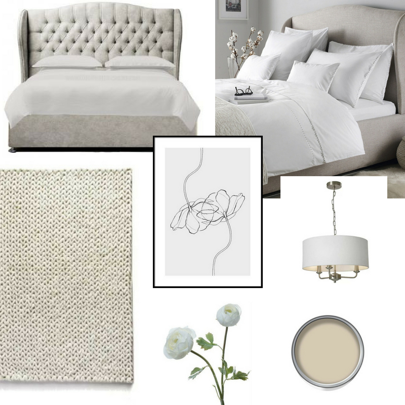
So, like with many of my makeovers, I started with a few items I loved & it all led on from there.
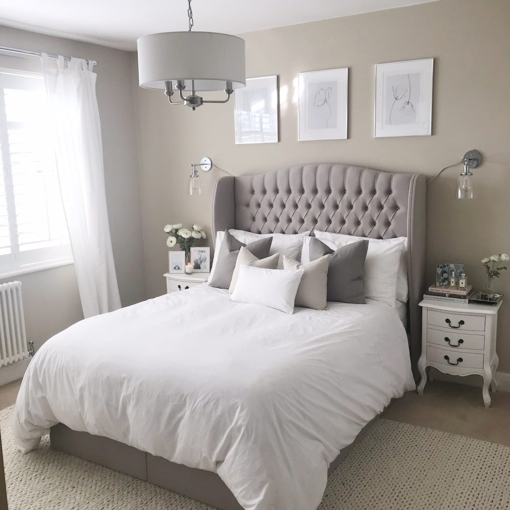
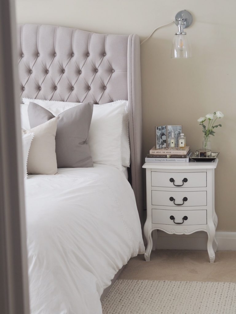
The first item to inspire me was a bed which resulted in me basically pulling my hair out. Up popped a beautiful winged buttoned bed as an advert on Facebook (does anyone else think their phone stalks them…it knows me better than I know myself sometimes & I hadn’t been searching either). After talking to Mr THTMM that evening, I went to order it the next morning only to find the page wasn’t working & much to my dismay, it had been discontinued. I then spent a week desperately searching for something similar, all in the name of interiors.
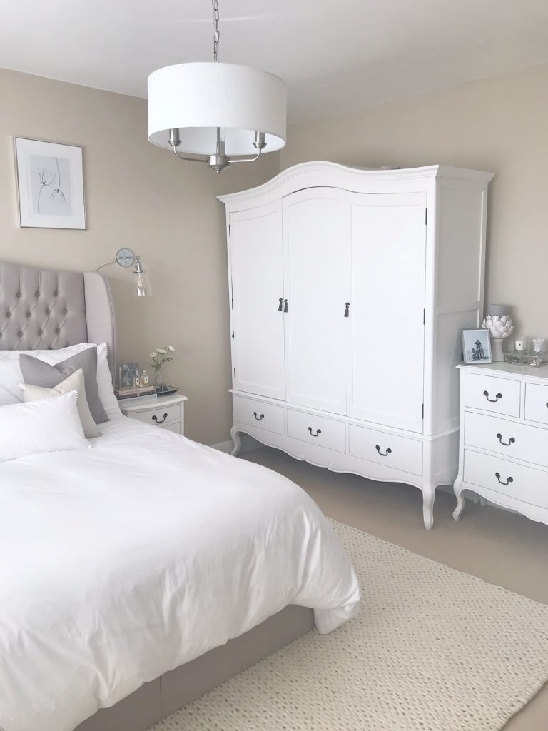
I eventually stumbled across Luxury Beds Online who basically make beds up to your specification. I decided upon a lift up ottoman bed to increase storage in the ‘Chelsea‘ design with winged buttoned headboard. They sent me out some fabric samples before deciding upon the house fabric in ‘Putty Linen’ & paid extra for the taller 150cm headboard to make a real statement. They’ve given me a 10% off discount code for followers using ‘HOM10’.
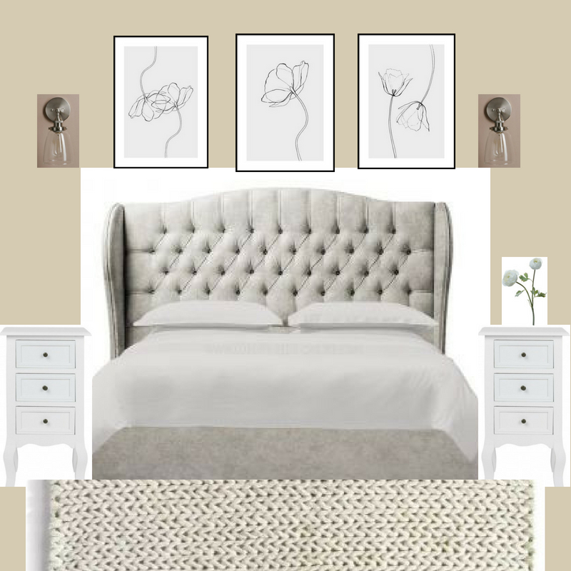
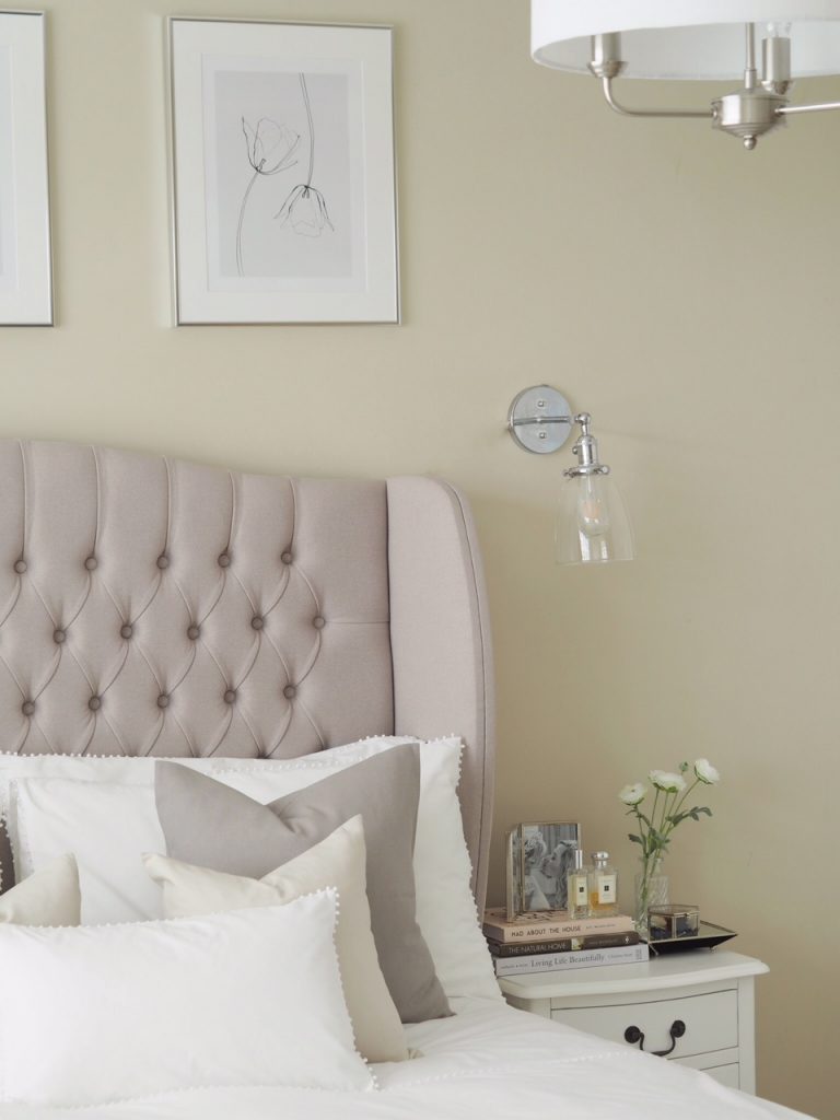
The other item which led my design was these three prints from Desenio, one of my favourite places to find affordable artwork & prints. I decided that the C & J frames, iconic as they were, needed to go. They are now over half of Instagram & I think I’d just outgrown them so these were going to replace them.
The three prints are the line poppy 1, line poppy 2 & line tulips at 30x40cm, all in silver 40x50cm frames with mounts (or as they call them, passe-partout).
Over time, the mood board grew & came together to become a full scheme which I then started implementing.
Another lesson learnt when doing my living room revamp was how important rugs are for adding texture & visually layering. Gone are the days when rugs on carpet was an interior design faux pas. Putting a rug under the bottom section of your bed (so the feet are on the rug) gives the illusion of space & who can deny wanting to sink their toes in to a thick soft rug first thing in the morning. Ideally, you should go for the biggest rug you can find.
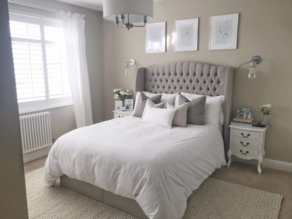
I found the most gorgeous selection of rugs from Modern Rugs who I’m going to be working with in the next few weeks. They are such a huge selection catering for all interior tastes & I eventually decided upon the Rug Guru Fusion Ivory in a huge 200x300cm. It is super thick (& super heavy….) & the knitted design brings texture as well as zoning the room with it’s sheer size.
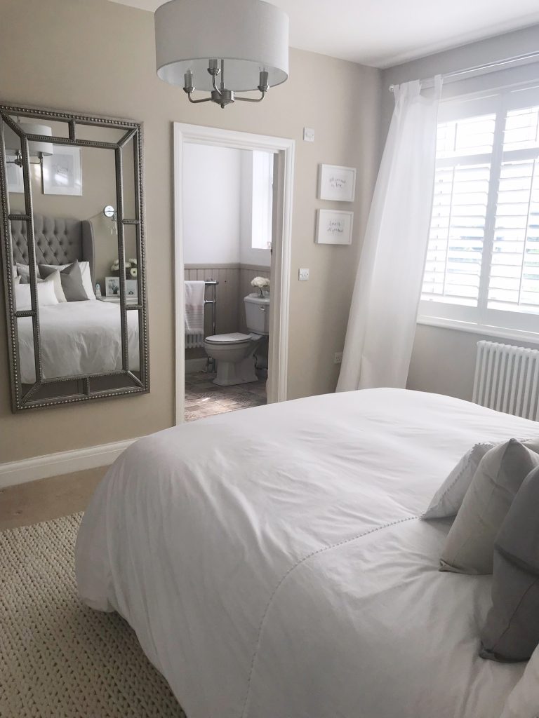
After looking for curtains, it was seemingly impossible to find much with a big enough drop for the high ceilings so I decided to keep our existing Ikea ones but just change the pole to a silver one which looks far more upmarket than the previous white one & brings across more colour (if you can call it that…) with the metallic elements throughout the room.
Keeping the bedside tables, triple wardrobe & chest of drawers, I was conscious that I still wanted the space to look different, but not too different. Obviously repainting would have made an immediate contrast but required a lot more time & effort plus I still love good old Wilko’s ‘Coastline’.
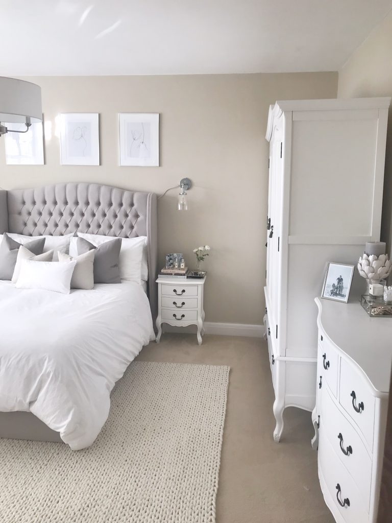
I sold my old bed & also the dressing table as it was all looking a bit too shabby chic or ‘matchy matchy’ & sometimes you can over clutter a room with furniture which I was conscious of with the new addition of the rug. Moving the dressing table really opened up the space which now looks SO much bigger.
My first port of call was removing the hideous lamp shade that had been ruining the room for far too long. It was a ‘nothing’ light fitting, cheap & not so cheerful but I know just how much lighting can impact a space & even changing the fitting can make a huge difference. I wish I’d taken a picture with it in shot but unfortunately I’m too much of a keen bean & ended up ripping everything out before taking ‘before’ pictures in all it’s glory.
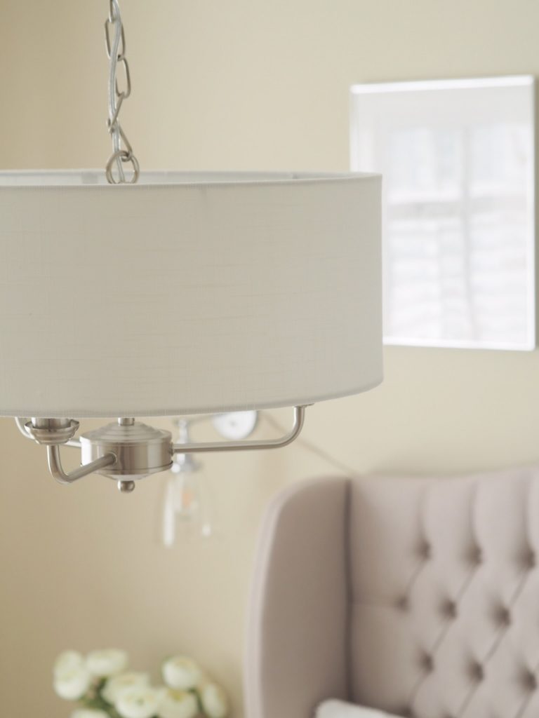
As I wanted to incorporate silver elements in to the neutral design & loved the light fitting in our living room revamp which was brilliant value for money, I decided to buy the same again & it looks just beautiful. This is the Grantham 3 light in satin nickel from Village At Home.
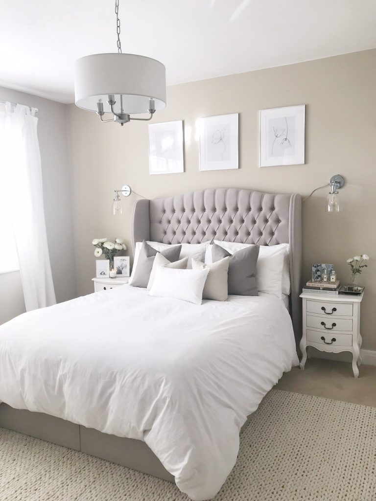
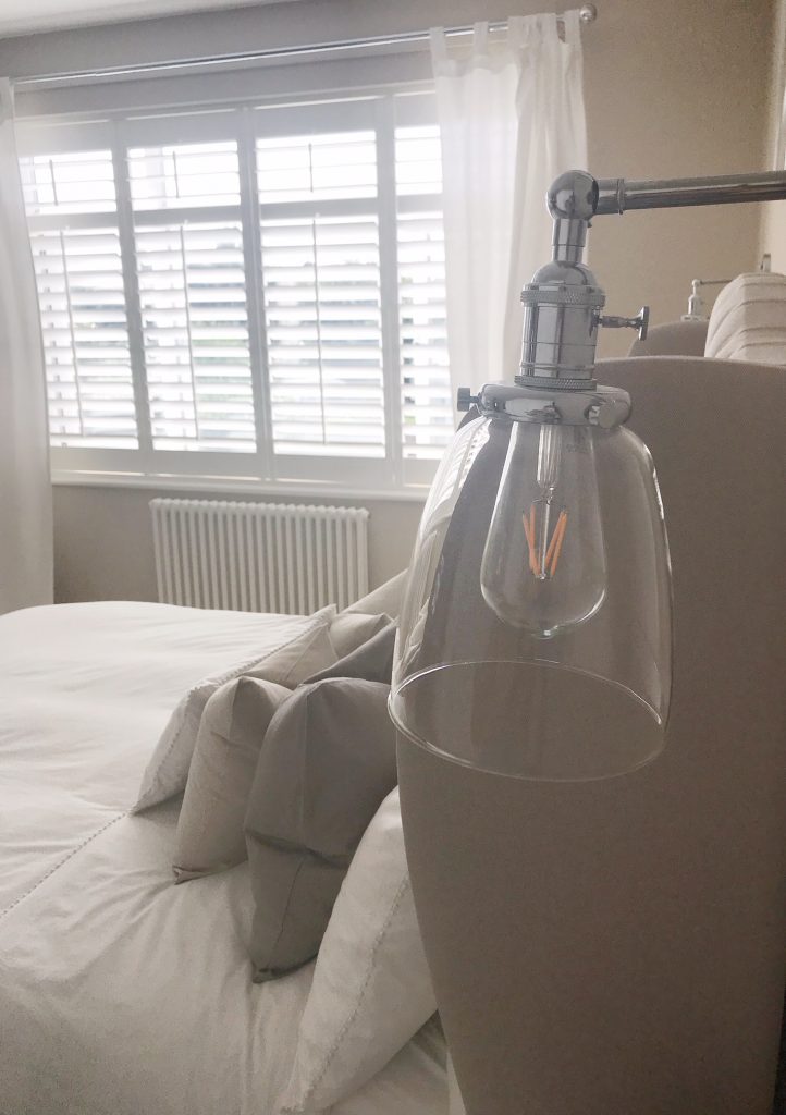
For additional lighting & to free up some room on the bedside tables (so I could style them more & add some pretty bits) we decided to remove the two lamps. Still needing lighting, I loved the look of wall lights but the cost of an electrician to fit then a plasterer to make the wall right again was extortionate so I found these lights on Amazon which look the same but instead of having to be wired in, are plugged in. The wire was put behind the headboard & then I used some of the wall paint to try to blend in the black wire with the wall to make it less noticeable. I also got the bulbs recommended to make a feature. Not bad for £80 in total!
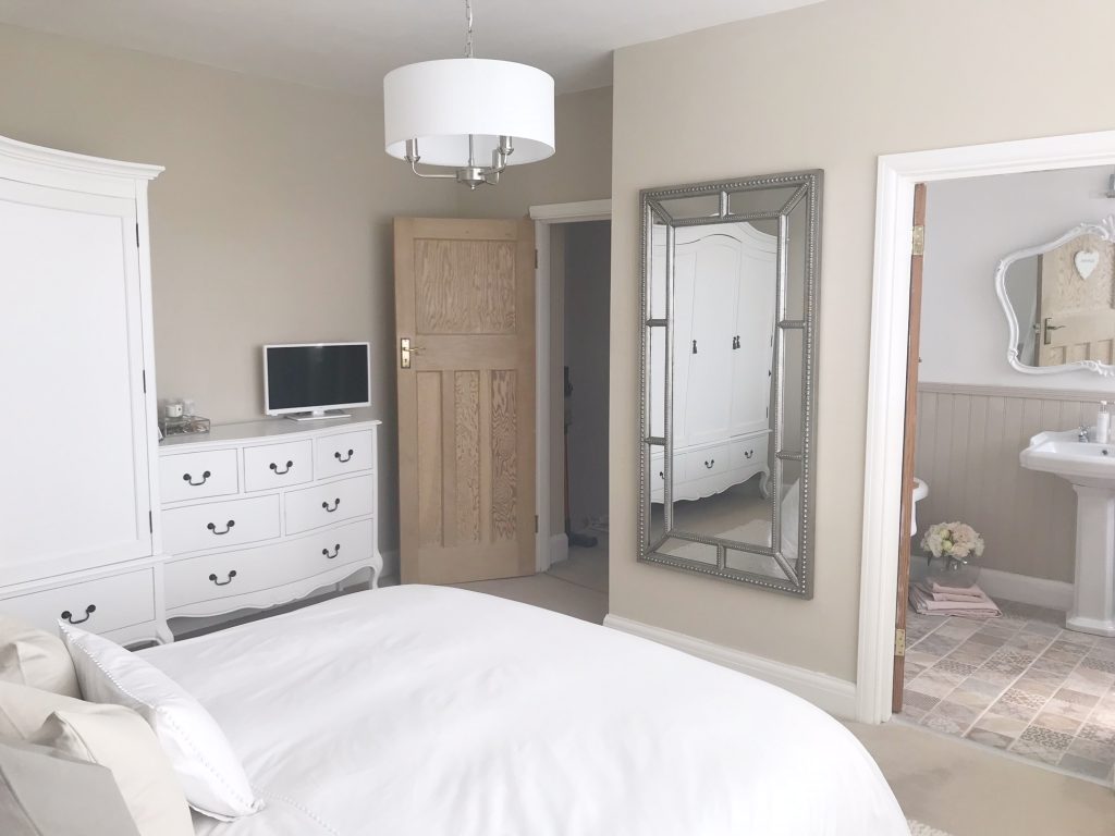
Much to Mr THTMM’s dismay, I also decided the big black TV which was half hanging off of the wall just wasn’t going to fit in to my new scheme & when removing the dressing table, I decided that I needed a full length mirror which needed to go there. Since losing weight I find it hard to picture myself & seeing as we don’t have any floor mirrors whenever I walk past one I’m always like WHATTTTT IS THAT ME?!. So the TV was sold & instead I opted for a smaller version of the one in our playroom (white…naturally) which is a JVC smart TV which you can find here.
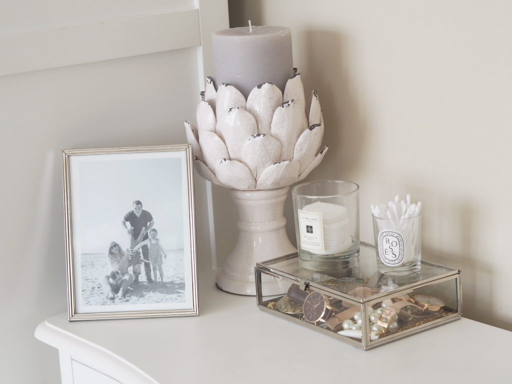
I also styled the top of the chest of drawers with a silver photo frame (this was a Homesense find, sorry!), this gorgeous artichoke candle holder from One World as well as the most beautiful jewellery box to keep all my necklaces & watches in from The White Company. I’ve used these empty candle jars (see my blog post here if you want to know how to wash them out) to hold cotton buds & pads.
On my bedside table I have some inspiration reading, some interior design books including ‘Living Life Beautifully‘ by Cristina Strutt (all about the Cabbage & Roses empire), ‘The Natural Home‘ by Hans Blomquist & ‘Mad About The House‘ by fellow interior blogger Kate Watson-Smith.
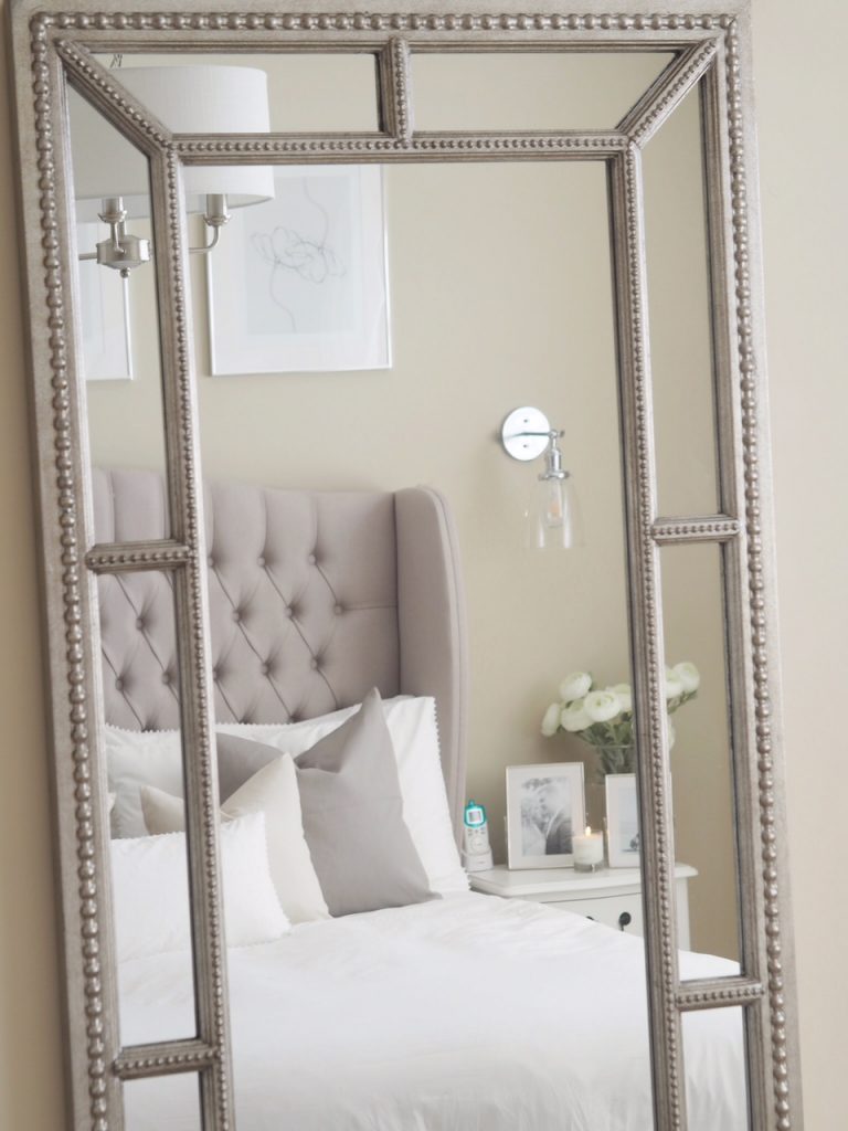
On top are my favourite perfumes, Jo Malone ‘Peony Blush Suede‘ & ‘Orange Blossom‘ as well as a frame from Homesense. To the right is a little silver trinket tray, also from Homesense, a small vase of artificial rannucular, again Homsense (sorry!) & finally the smaller hexagonal jewellery box from The White Company.


The mirror I went for is this beauty, the Lawson from Wayfair. It’s stunning & makes the space look bigger, brighter & bounces light around…plus I can finally see what I actually look like before I leave the house. It also has beading detail which ties in with the bedding!
Speaking of bedding, I’ve been lusting over the Avignon bedding from The White Company for such a long time. It’s simple but oh so elegant & lets face it, pom poms are life. This delicate trim adds texture & charm plus it’s so super soft, it’s like a dream to sleep in & honestly feels like you’re in a hotel.
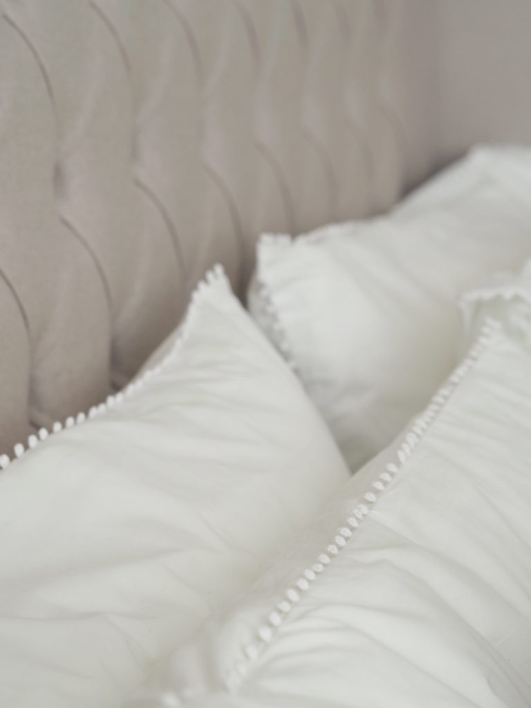
I found some cushion covers which were a bargain at £2.99 for the lighter 40x40cm & £3.99 for the 50x50cm which are very similar to the headboard colour, both from H&M here. I always use feather pads as they plump so much nicer & just look much more expensive.
On Joe’s bedside table I picked up two silver easel frames which house some of our most treasured photos in from The White Company as well as my favourite candle fragrance from them, Verveine.
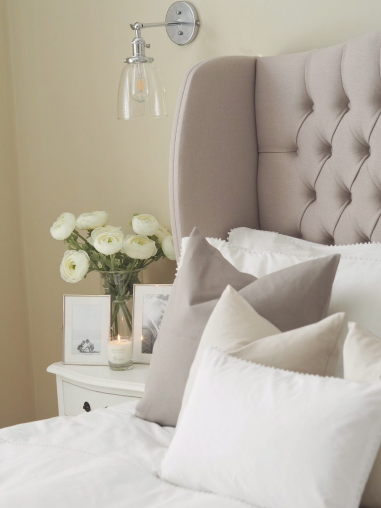
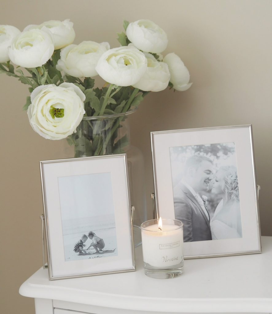
A room is never complete without some flowers so opting for fake, I found these artificial ranunculus from Brissi in the sale. They are so super realistic & have that simple, elegant look I was after. I popped them in this vase from Amazon.
Finally, after all was said & done, I looked at the room & realised that the one thing that let it all down was the enormous ugly radiator under the window. Kind of necessary in the UK but not exactly the most attractive of things so I decided if you’re going to do it, you might as well do it properly & set to work to find a solution. I ordered a more traditional (& beautiful!) column radiator which you can find here from Best Heating on Thursday & by Friday morning they’d arrived ready to be fit by my plumber. I cannot even tell you what a difference just changing this made…it gives it such a nicer more ’boutique’ feel…..now I just need to change every other one in the house eek.
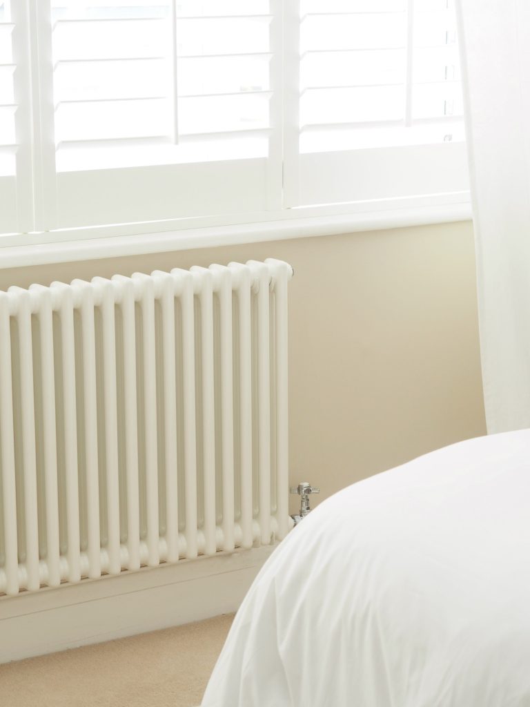
I hope you love it just as much as I do & this proves that even the small changes can make a huge impact!
Love,
*This post contains some gifted items & affiliate links

Wow just wow
Wonderful. Can I ask you a random question? How do you keep your peonies from going brown. Mines don’t open just go brown& yucky x
Hi lovely, I have no idea….I’ve only had one that’s done that & it was like it when I bought it. I don’t do anything differently but maybe a bad batch? x
Love it ?
Love your new bedroom scheme … every detail is so well thought out, even down to using candle jars for storage – genius! Love the bedside light fittings and will definitely be checking similar out for our guest room where space is right for tables. The whole look is tranquil and luxurious. I really enjoy following you and love your whole house ?
Oh thank you so much – what a gorgeous message x
Love your makeover Charlotte. The room has a whole new persona – so calming, tranquil! Beautiful just like the rest of your home. Love your posts/blogs ?
Thank you so much xx
I love it ? could you please tell me what the paint brand and colour is? I’m looking for something very similar in my bedroom. Xx
Hi lovely, it does say in the post but it’s Wilko’s ‘Coastline’ xx
This is stunning – love it so much and very inspirational, especially the lighting … however, may I ask a random question please? I know I have far too much ‘stuff’ and am always trying to declutter and organise – thanks for all your tips on this as well – but to lose a major piece of furniture like a dressing table fills me with dread – where have you put everything that was it it ? Thanks, loving the Friday house tours as well, just fab. Linda xx
Hi Linda, we have regular clear outs & you’ll be surprised how little ‘stuff’ you need really. Be ruthless! Nothing feels better x
I clearly ‘must try harder’ ? Charlotte … I’m not as ruthless as I should be I know. Right let’s get to it x
This bedroom is looking beautiful. I liked these amazing tips. Thanks a lot for sharing this post.