I’m a huge fan of all things striped – elegant, timeless, eye-catching & versatile. In fact, 90% of my clothes are the classic brenton stripe & it doesn’t just stop there as I’m just as obsessed when it comes to stripey interiors too.
Far from the typical nautical seaside theme, it can definitely suit all interior looks. From cushions to walls, vertical to horizontal; they’re bound to add a touch of texture without being too patterned, clashing or invasive.
Not only do they LOOK brilliant but they also play a little trick on our brains to expand a space & make it look bigger. If you want your ceiling to look higher then go for vertical stripes to draw the eye upwards. If you want your room to look wider then choose vertical.
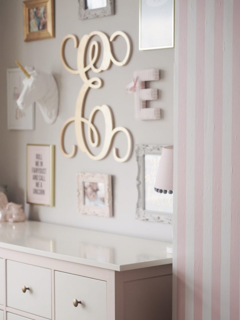
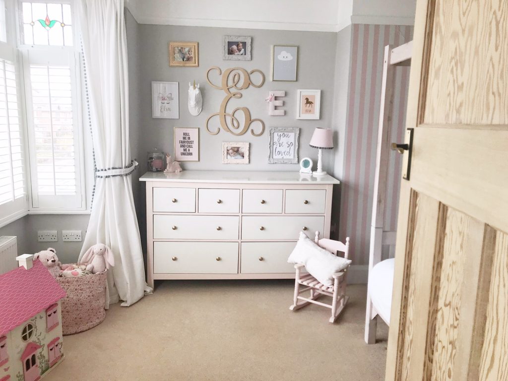
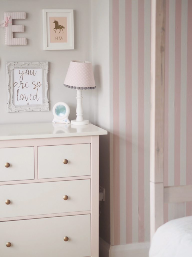
In Elsa’s bedroom I did have a painted feature wall of pink, white & grey (a winning colour trio) stripes, it was a simple, cheap (a few sample pots, a brush & some masking tape) & relatively painless task which added a pop of colour, you can read my tutorial on how I did it here. When we decided to do a slight room update to paint all the walls from white to grey with the new addition of shutters I instead opted for this pink & white wall mural sticker from Pixers.
So how do you go about bringing stripes in to your home & how should they be used?
Creating a statement –
Stripes can be your statement or ‘wow’ feature/piece in a room. You can bring in colour without it being one solid block & too in your face. Take for example the monochrome trend; one white wall would look dull, one black wall would look striking yet looming so mixing it up with a striped black/white wall adds interest, pattern & that added character.
Bold or subtle –
Stripes can be either bold or subtle depending on the width, length & repetition. For example, thick stripes tend to be more bold & eye-catching whereas thinner ‘ticking’ stripes are softer on the eye.
Higher ceilings –
If you’d like your ceilings to be higher to create that feeling of space then horizontal stripes may be the way to go. They naturally draw your eyes upwards creating an illusion of height & have been used this way within interior design for centuries.
Wider walls –
Horizontal stripes are a bit more edgy & modern than traditional vertical & instead of drawing upwards they do the same, but across.
Consider the size of the room –
Smaller rooms such as downstairs toilets can accommodate a bit of a ‘punch’ as people don’t tend to stay in there too long. Otherwise, stick to the notion that the bigger the room, the wider the stripes need to be so it doesn’t end up looking too busy.
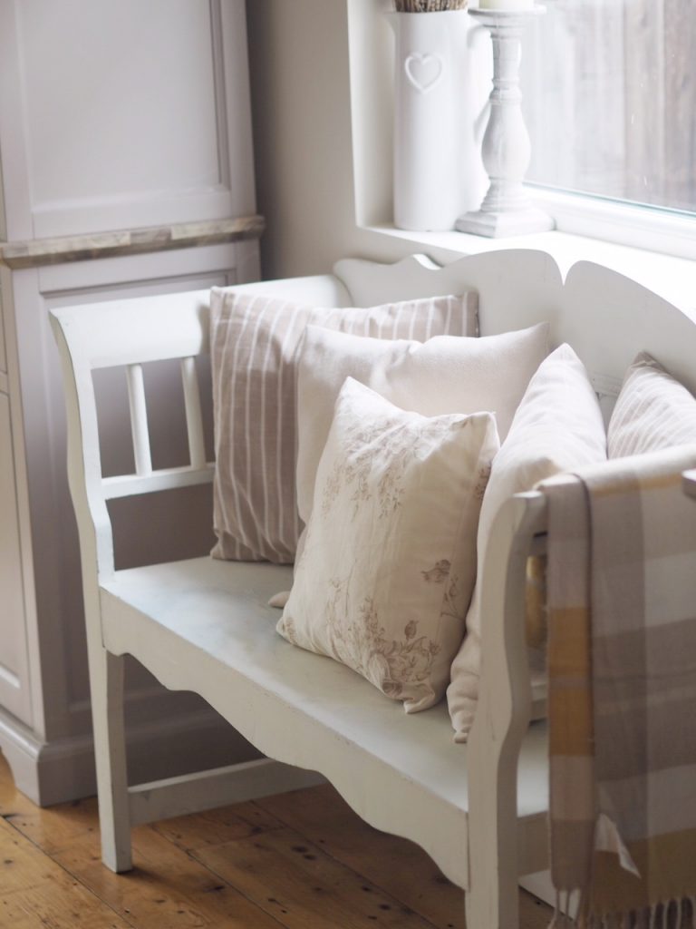
Stripes aren’t just for walls –
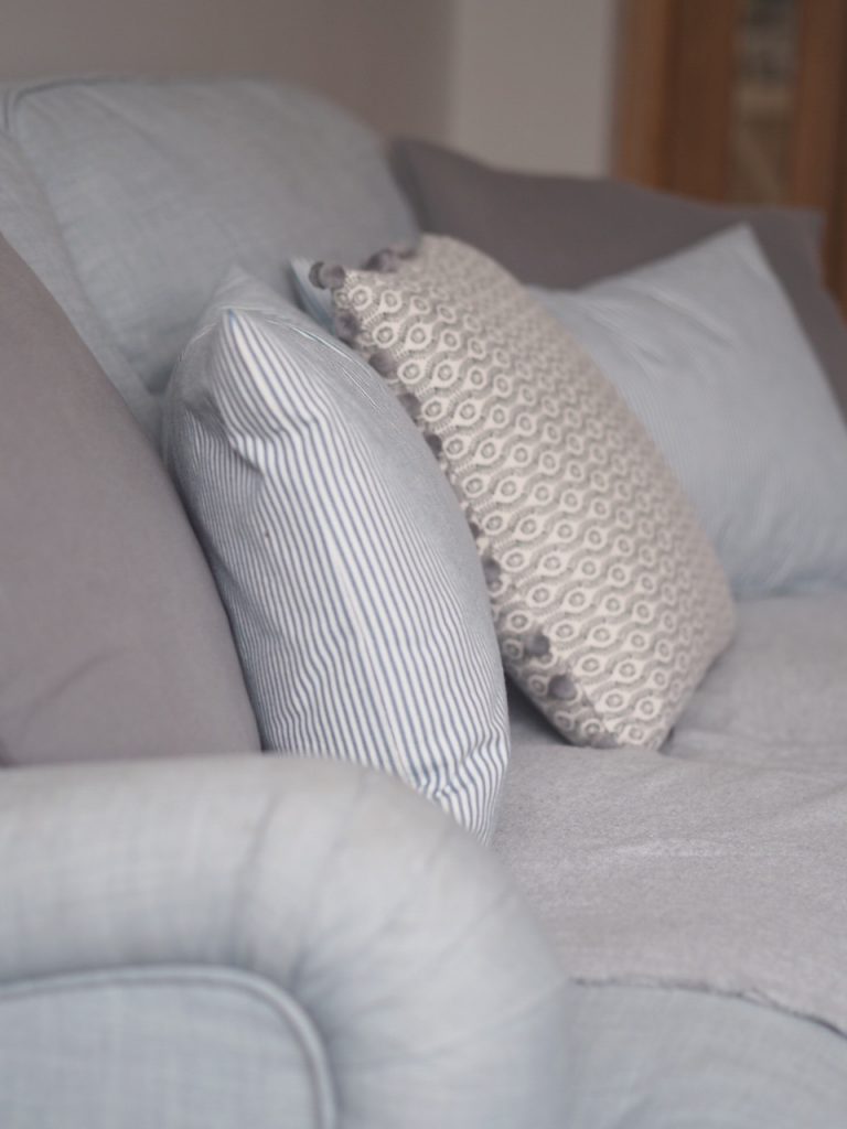
Stripes can be used in all sorts of design. From striped carpets (they are just perfect for stair runners!), soft furnishings like curtains, cushions & rugs as well as in accessories like baskets, frames, candles & so on. They can be combined with other patterns easily such as floral or checked & are easily replaced if you get bored/fancy a switch up rather than repainting. A subtle nod rather than a dramatic shake.
I’m sure you have stripes somewhere in your home already if you look; they are one of the fundamental parts of interior design & never go out of fashion. How do you chose to incorporate stripes?
Love,

Hi Charlotte
I’ve recently come across your website and I love it. I enjoy reading your blogs and taking ideas from your beautiful designed home. We’re currently renovating our property so getting a lot of inspiration from you!! I wondered where you got the letter E for your daughters bedroom as I’d like to get one for my little girls bedroom. Also I really like the window effect mirror you have and your console table and wondered where I could get one from.
Best wishes
Katie
Hi Katie, thanks so much! The E is from @loupy_designs on Instagram. The mirror is The Range & the console you can find on the shop my style page of my blog x